Standout Features:
- Split-line wordmark with a stylized diacritic “Ž”
- Vibrant tonal illustrations with organic, emotional forms
- Strong feminine color palette
The mental wellness and counseling platform Posložena takes its name from the Croatian for “put together,” reflecting its focus on relational balance. The brand's visual identity, by Anna Lukenda, uses a split-line name to symbolize this process.
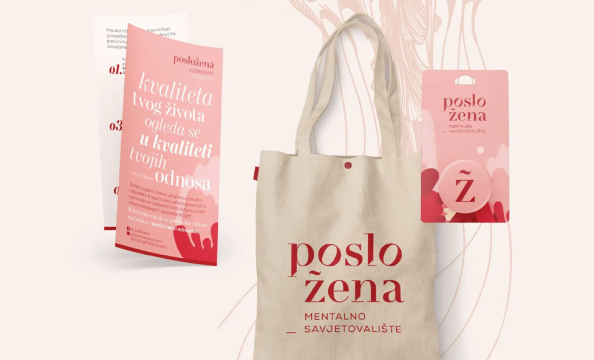
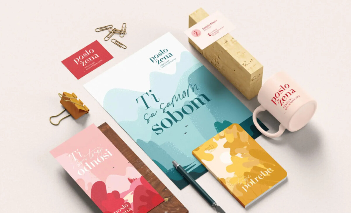
This logo employs a split-line wordmark, “poslo žena,” using a high-contrast transitional serif with bespoke letterforms. The name’s two-line structure and the distinct, gently flicked diacritic on the “ž” are key. This design powerfully symbolizes healing and aligns with the brand’s empathetic, restructuring goals.
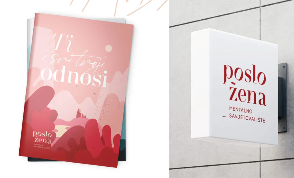
Across these health and wellness print materials like posters and brochures, abstract landscape illustrations in tone-on-tone gradients are featured. These range from dusty rose to terracotta and mustard yellow to teal. The visuals reflect internal emotional landscapes and counseling that carefully guides you through them.
Aside from blush pink, muted cyan defines the brand's visual environment. This expressive yet refined palette aligns with an emotionally intelligent initiative, as research published in journals like PMC indicates that softer, muted color tones are preferred for creating calming and psychologically supportive environments.
Anna Lukenda’s branding for Posložena illustrates that a deeply intentional design system can make a profound statement. By ensuring every visual choice aligns with the brand’s mission of emotional organization and strength, the identity becomes a powerful tool for fostering connection and conveying a message of evocative, grounded healing.