Standout Features:
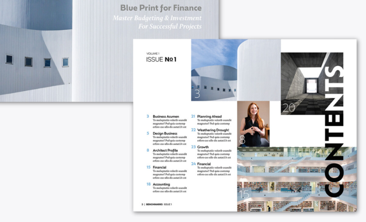
- Grid-driven, modular layout system
- Architectural photography as design structure
- Sophisticated editorial typography hierarchy
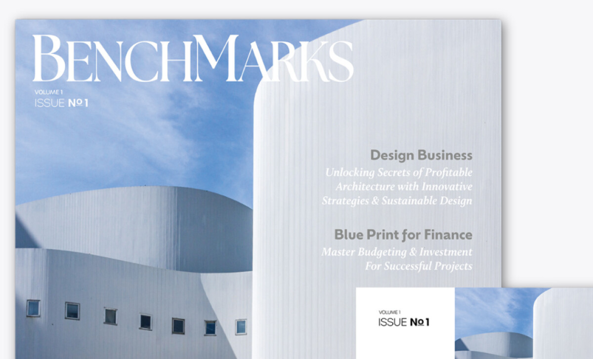
Benchmarks isn’t just a magazine; it’s a prototype for how design publications should be built for design audiences. Created by A Bock Design, LLC, this debut issue blends layout clarity with spatial intelligence, capturing the interests of architects and financial planners alike. Every page is a balance of logic and elegance.
The entire design is grounded in modular grid principles, giving content breathing space while maintaining alignment. Sections are neatly divided using both typographic cues and image breaks, ensuring no detail is out of place. The rhythm and balance of the layout give the magazine a tactile professionalism, ideal for presenting complex industry insights.
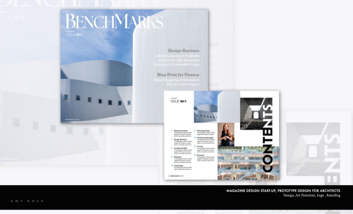
Rather than using photos as decoration, the magazine integrates architectural images directly into its flow. Curved building exteriors, minimalist interiors, and geometric forms anchor entire spreads, reflecting the visual language of the target readership. These photos provide not just context, but compositional guidance across each article.
Typography in Benchmarks is never an afterthought. Large headlines use a refined serif font to draw in readers, while smaller subheads and body text offer contrast with precise sans-serif selections. Weight, scale, and kerning are masterfully adjusted, giving readers a visually intuitive hierarchy to follow without disruption.
Benchmarks exemplifies the power of intentional editorial design. A Bock Design, LLC didn’t just design a magazine, but they engineered a user experience for the intellectually and aesthetically inclined. From layout structure to typographic nuance, every decision invites deeper reading and appreciation.


-preview.jpg)
