Standout Features:
- Red and black palette
- Serif logotype with subtle decorative elements
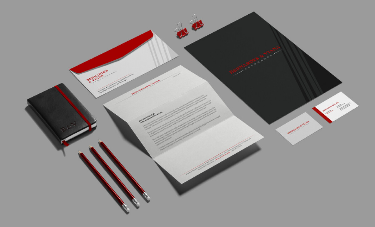
- Consistent branded stationery system
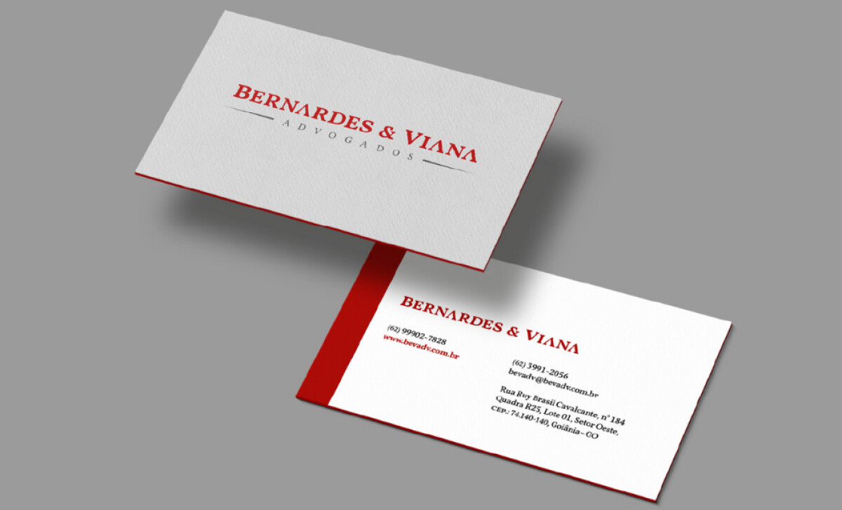
TARJA Gráfico, an agency that delivers graphic solutions to guide brand recognition, designed the identity for Bernardes & Viana Advogados.
The brand identity is anchored in a striking combination of deep black, bright red, and crisp white.
Black dominates large surfaces like the presentation folders, while red serves as a primary accent color in the typography and other graphic lines.
The choice of red is also a practical one for gaining attention. According to Verywell Mind (2023), red is one of the most visible colors in the color spectrum, second only to yellow.
You'll see a very classic and elegant serif font used for the logotype. The omission of the bars in the "A's" is a nice, subtle decorative touch.
However, the all-caps typography has a modern sense of spacing that keeps it from feeling too ornate, despite the serifs. Plus, it ensures that the firm’s name dominates the first impression.
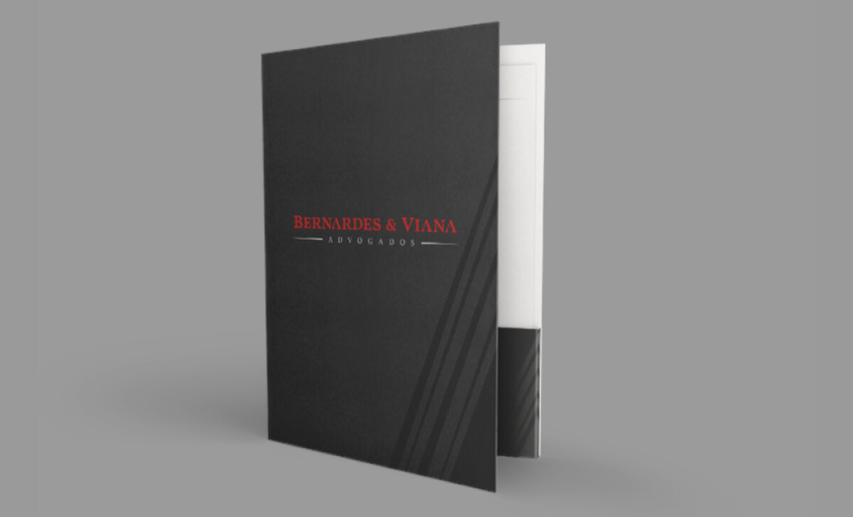
The stationery suite — including business cards, letterheads, and presentation folders — maintains a rigorous alignment of the logo, typography, and color usage.
Using a very corporate palette alongside a friendlier, decorative font, TARJA Gráfico managed to reflect how the law firm prides itself on the close yet professional proximity maintained between its lawyers and clients, making it one of the best legal print designs.
The big challenge for any law firm's branding is to visually communicate its unique approach, whether that's collaborative advice, aggressive litigation, or a mix of both.
That's why brands turn to expert partners, and our team has ranked the best agencies worldwide to make finding them simple.
Visit our Agency Directory for the Top Print Design Companies, as well as:
Our design experts also recognize the most innovative design projects across the globe. Visit our Awards section to see the best & latest in print design.