- Designer: JMMercier
- Client: Berto
- Category: Print Design — Hospitality
- Location: Montreal, Canada
- Project Brief: Create hospitality print design for Berto that reinterprets Italian osteria traditions through a warm, vibrant visual identity that complements its contemporary dining experience.
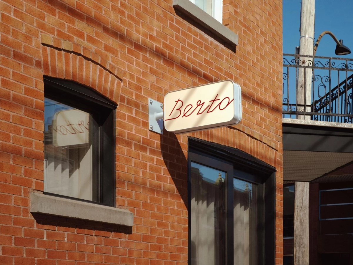
Hospitality print lives across small objects, from the blade sign read on the sidewalk to the matchbook carried home. Berto, a new Montreal restaurant with identity work by JMMercier, threads those objects together with one cursive wordmark and a cobalt, cream, and oxblood palette.
The wordmark reads as a fast hand, looping the B and letting the o trail off like a signature. It runs red on the cream lightbox and white on the blue matchbook, so recognition rests on the letterforms rather than one locked color.
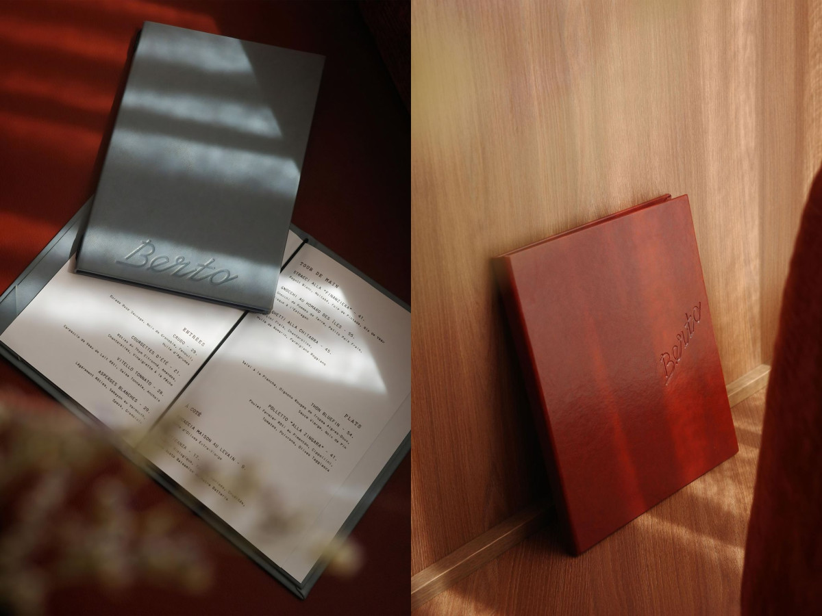
A typewriter face carries the secondary text, from the all-caps menu listings to the "A PRESTO AMICI!" inside the matchbook. The pairing sets a loose signature against a rigid monospace, which gives the system an osteria register without the checked-cloth nostalgia.
The menus lean on material over print. The wordmark sits blind-embossed into graphite and oxblood leather covers above cream paper inserts, and no secondary mark backs up the script, so the whole identity rides on one set of letterforms.