Bleu Soleil (slide 1)
Bleu Soleil is a coastal beach bar providing a relaxed and sophisticated atmosphere. Invisual Studio developed a direction that blends elegant and casual aesthetics to convey a vintage feel relevant to modern audiences. This work features deep navy and cream tones paired with hand-drawn illustrations across menus, coasters, and signage.
Bleu Soleil (slide 2)
Consistency through restrained typography and small cocktail-themed iconography
Bleu Soleil (slide 3)
Minimal color palette and illustrated figures maintain the brand’s personality on any medium
Bleu Soleil (slide 4)
Deep navy creates strong contrast and improves readability in low-light settings
This website uses a colour palette of 4 colours
  • #2B315D
  • #C6B4A2
  • #E4CAB1
  • #CEE4F5
Technologies & Tools
Description
Team Behind the Design
  • Agency:  Invisual Studio
  • Client: Bleu Soleil
  • Category: Print Design — Hospitality
  • Location: Bandung, Indonesia
  • Project Brief: Develop a cohesive visual identity and print collateral for Bleu Soleil, translating the restaurant’s relaxed coastal personality into illustrated menus, brand graphics, and tactile materials that reinforce storytelling and atmosphere across the dining experience.

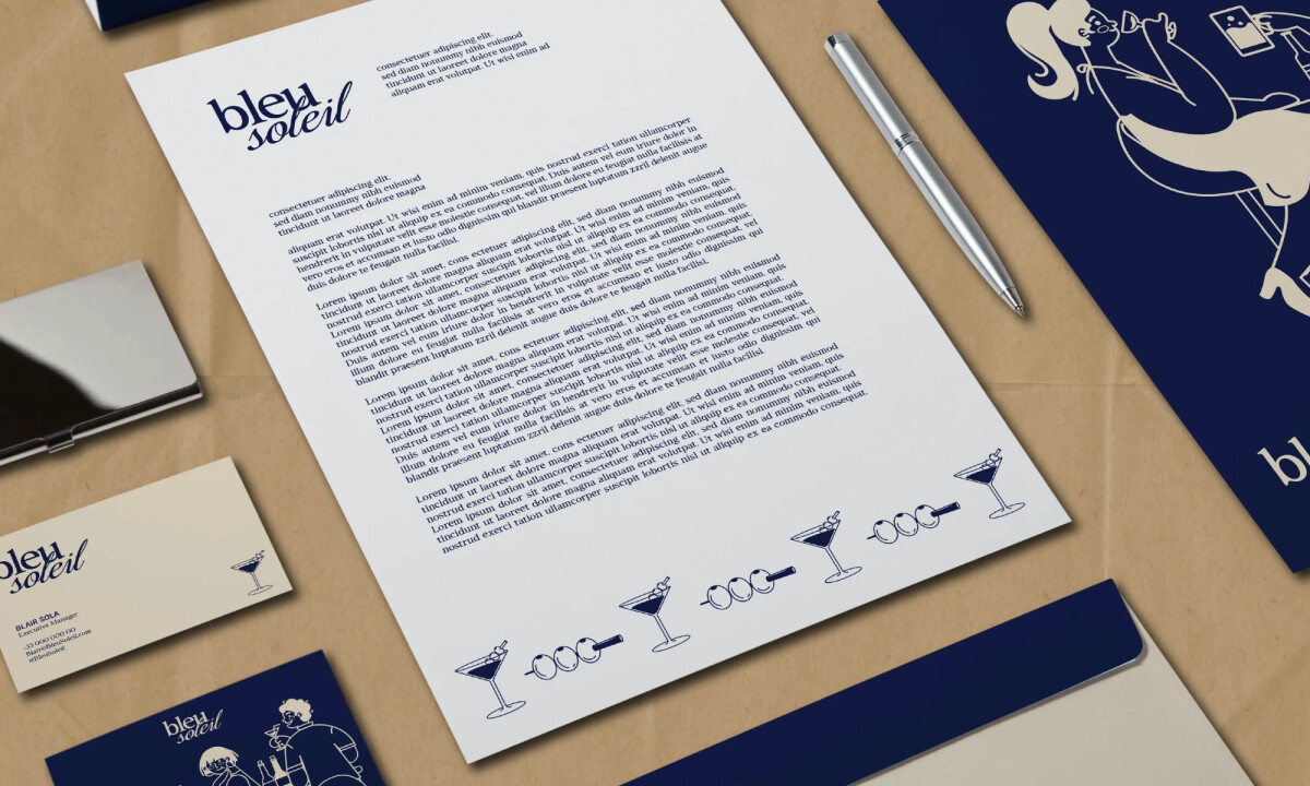
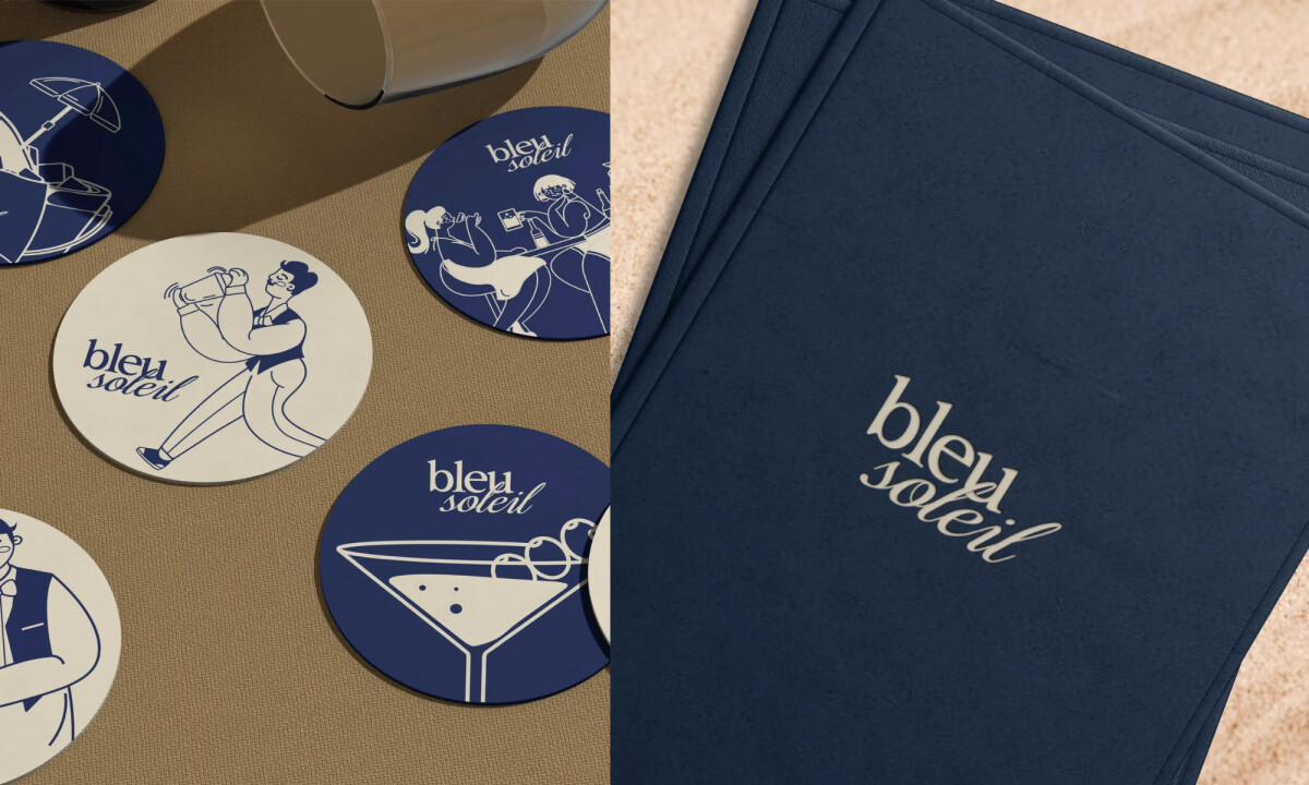
Bleu Soleil’s print identity treats menus and collateral as extensions of the restaurant’s atmosphere. Hand-drawn illustrations, relaxed typography, and warm color accents create a casual Mediterranean mood while keeping information clear for diners. The cohesive system shows how illustration and layout can strengthen hospitality print designs.

Ready to elevate your designs?