- Article by
- Jermaine Dela Cruz

#D9072A #EFF1F0 #303030 #DD0685
- Agency: FutureBrand
- Client: Brembo
- Category: Print Design — Manufacturing
- Location: Shanghai, China
- Project Brief: Produce print design that communicates Brembo's evolution into a solution-driven brand through bold visuals and cohesive identity systems.
Strong manufacturing print design earns attention through consistency, not complexity. Every surface, from a product catalog to a business card, has to carry the same brand weight without losing anything in translation. FutureBrand's work for Brembo gets that right.
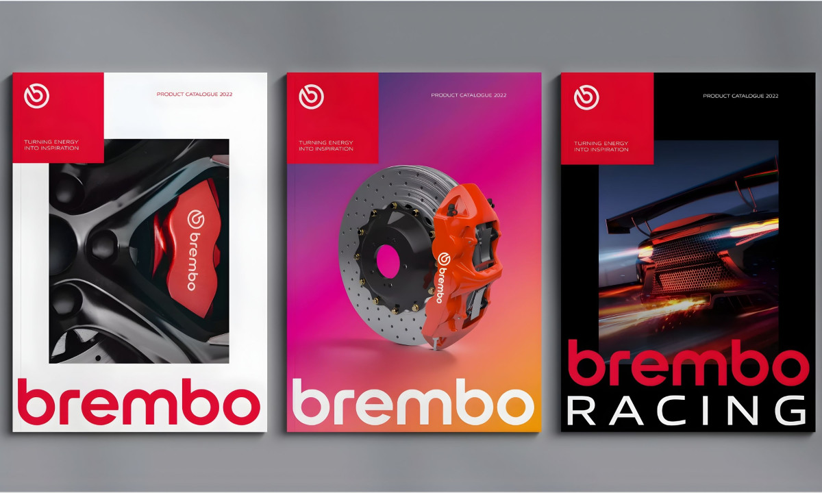
The system starts with a tight kit of parts. Brembo's circular wave mark, high-saturation red, and geometric sans-serif wordmark give FutureBrand three elements to work with across every printed piece. No gradients, no secondary illustrations, no texture fills. The constraint is the point.
The color does structural work throughout. Brembo uses a pure, high-saturation red with no orange or pink drift, the kind that photographs cleanly under any lighting and holds its intensity whether it sits on coated stock or fabric.
White provides the only contrast. The typography stays minimal, letting the mark and the color carry the communication.
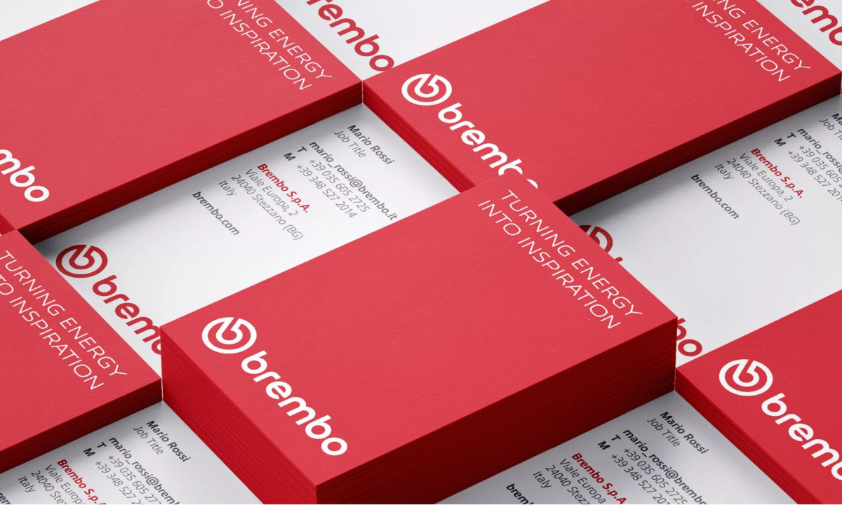
Business cards follow the same logic. Red front face, white mark and tagline. White back with contact details in a clean left-aligned type stack. The cards use red-edged stock, which adds a material detail without introducing a new color or finish.
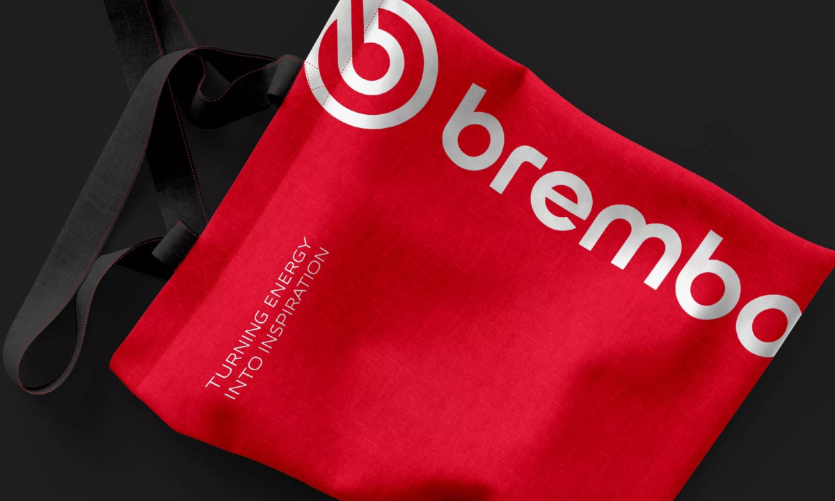
The brand extends to physical merchandise with the same discipline. A roll-top backpack places the mark and tagline inside a recessed panel on saturated red fabric. A tote bag scales the mark large across the full face. FutureBrand designed every piece to work in isolation. That's why they hold together.
Discover more from FutureBrand
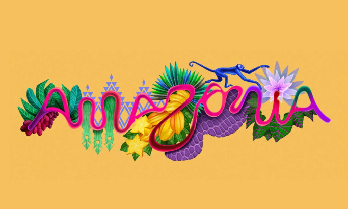
Amazônia Brasileira