Standout Features:
- Geometric pattern for visual interest
- Warm, gradient color scheme
- Clean, legible typography
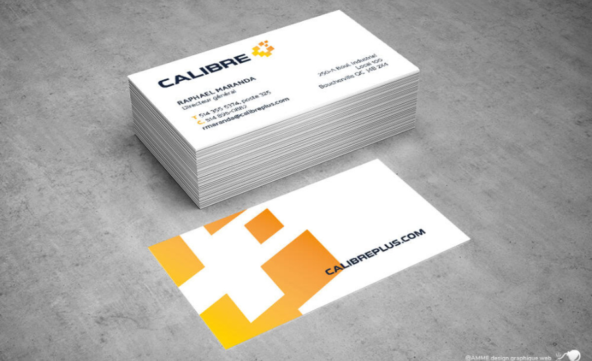
Calibre, a company focused on industrial and commercial insulation, uses a business card designed by Amme Design. This business card has the daunting task of serving as a crucial first point of contact, and so the agency focused on optimizing eye-catching design and an informative layout in equal measure.
The card features a striking geometric pattern that immediately catches the eye. Positioned strategically on the left side of the card, this graphic incorporates a stylized cross within a square. This pattern adds a modern and dynamic feel to what could have been a plain design.
One of the most notable aspects of the card is its warm, gradient color scheme. The gradient transitions from a vibrant yellow to a softer orange. The colors work harmoniously with the white background, ensuring that the essential information remains the focal point.
Furthermore, the typography used on the card is clean and legible. The font choice is a modern sans-serif, which maximizes readability and helps maintains its professional tone. The placement of the text is strategic as well, with the company name "CALIBRE" and contact information neatly organized in an easily digestible format.
Ultimately, Amme Design delivered a business card design that is both visually engaging and functionally effective — it’s simple, but gets the job done.
-preview.jpg)