Team Behind the Design
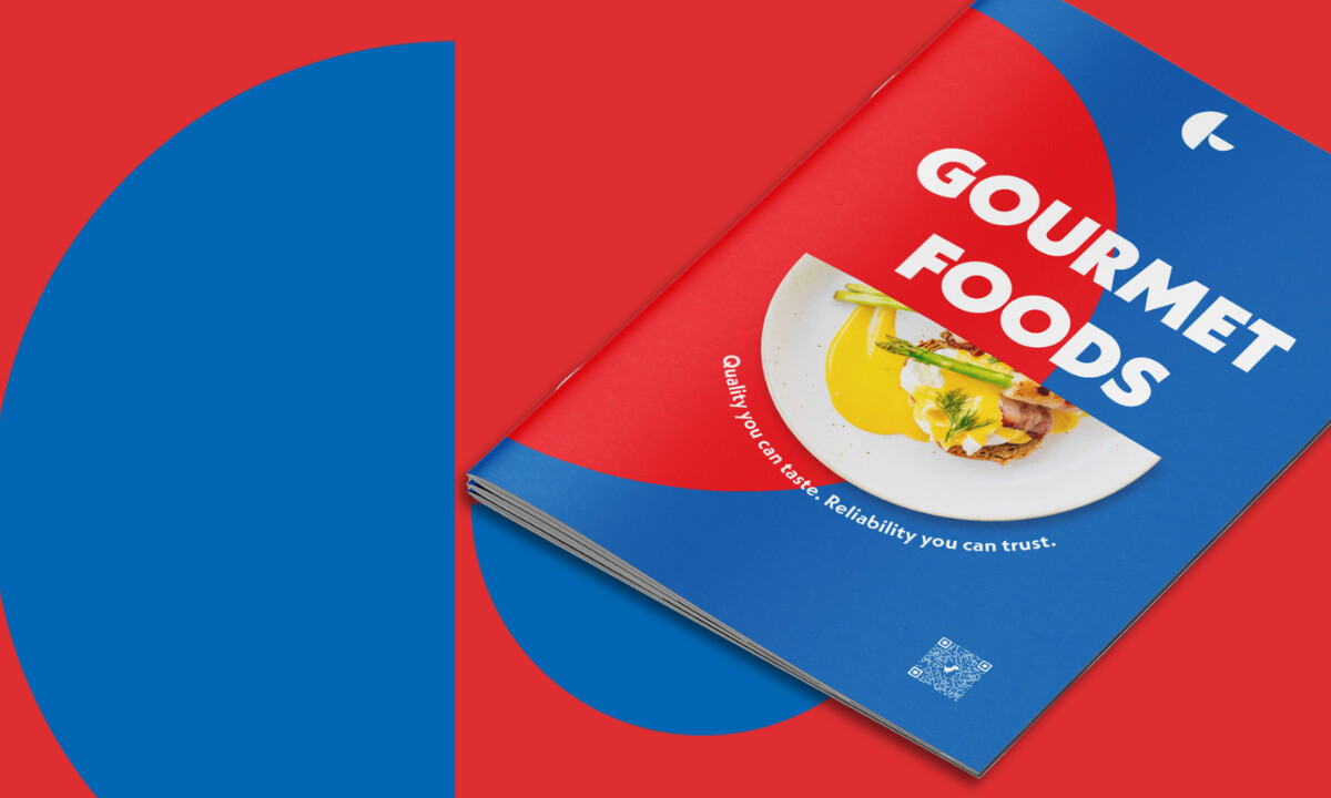
The thing about print is that it tells the truth. You can’t hide behind transitions or motion graphics; the design either holds attention or it doesn’t. When I saw Elevation Design’s work for Gourmet Foods, I saw a brochure that understands its medium: confident color, tight structure, and a real sense of purpose.
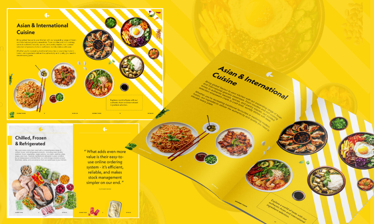
This wasn’t a product list pretending to be a catalogue. It’s print doing what digital rarely does anymore: slowing the reader down to appreciate hierarchy, balance, and the sensory pull of well-shot food imagery.
Print Design Analysis
Most FMCG brochures read like inventory sheets. They run the risk of being functional but forgettable.
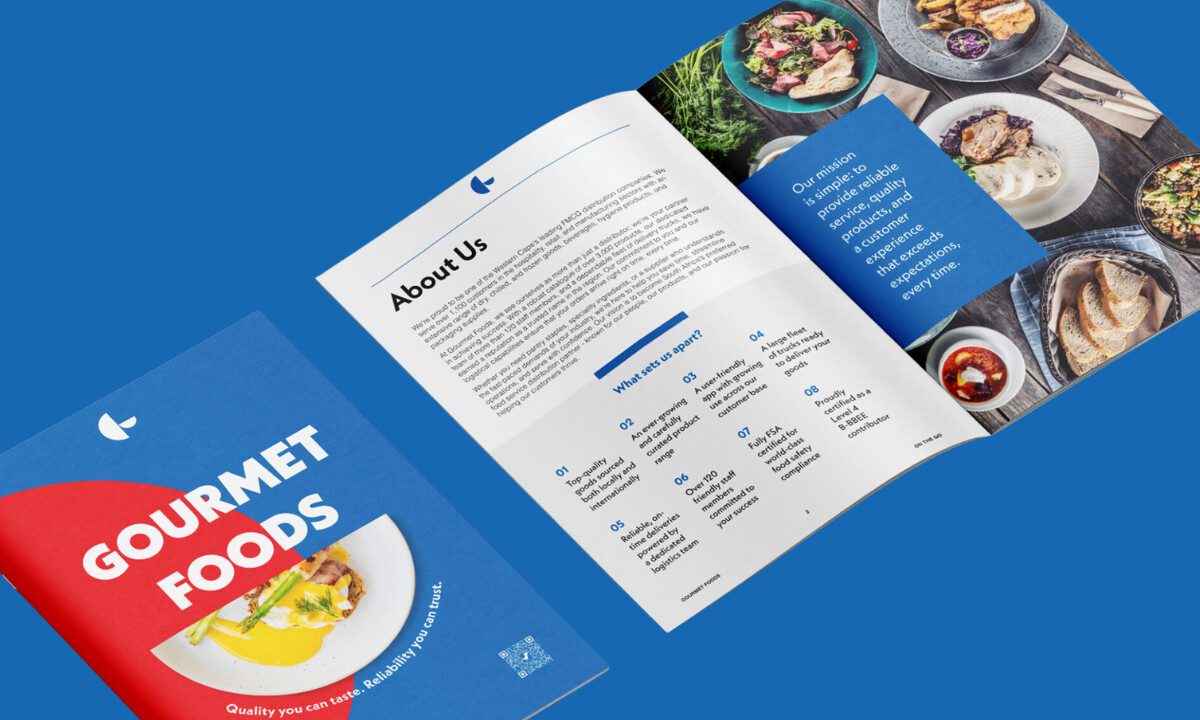
Elevation Design flipped that convention by turning the catalogue into a visual journey through flavor and form. Each section uses color to define category and rhythm, allowing the layout to feel alive without losing order.
The brand’s red, yellow, and blue aren’t just palette choices; they act as wayfinding tools, giving every spread its own pulse while maintaining brand cohesion.
It’s design as both navigation and storytelling.
Outstanding Design Features
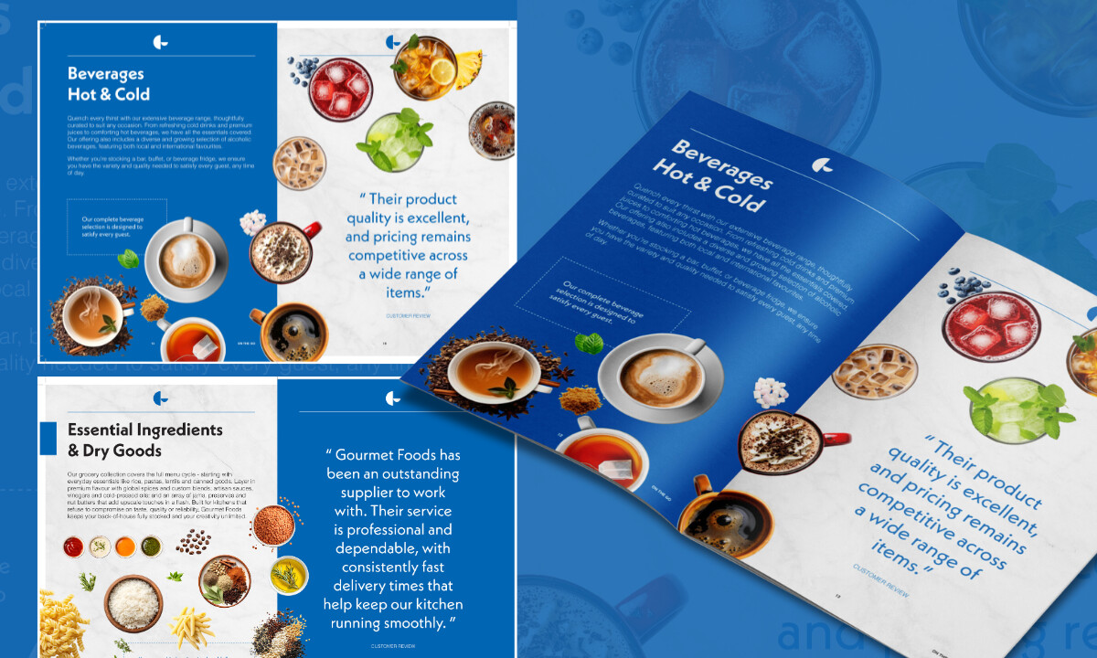
1. Color as a System, Not Decoration
What stood out to me wasn’t the food photography alone; it was the control of color.
Each section owns a hue that signals, “You’re in a new chapter now.” It’s smart, not decorative. The palette works like a map, guiding the reader through the range without them ever realizing they’re being guided.
2. Typography That Anchors Trust
What makes the typography effective is its confidence. Elevation Design chose a clean, geometric sans-serif that communicates clarity and experience without trying to impress. It carries the weight of a long-standing brand: steady, familiar, and reliable. The type doesn’t compete with the imagery; it supports it, grounding the brochure in order and professionalism.
3. Photography That Sells Context, Not Just Product
The imagery avoids sterile packshots, opting instead for plated, appetizing compositions that create emotional connection and elevate perception.
4. Layout That Marries Rhythm and Restraint
Balanced use of grids and negative space allows vibrant colors and rich textures to shine without overwhelming the eye.
What Agencies Can Learn from Elevation Design
1. Print Should Be Intentional, Not Nostalgic
Elevation didn’t design a brochure for the sake of tradition. They made print functional again by giving it structure, hierarchy, and rhythm.
2. Color Can Be Strategy, Not Decoration
The smart use of red, blue, and yellow proves that color can clarify information flow as effectively as it can express brand emotion.
3. Photography Is Narrative
By shooting food the way people experience it — plated, fresh, and inviting — the design connects emotionally rather than commercially.
4. Pacing Matters
What makes this brochure work is how it’s built to be read, not just flipped through.
Elevation Design planned the pacing like a photo editor, alternating full-bleed imagery with white space, mixing dense spreads with lighter ones, and ending sections on visual pauses that reset attention.
Each spread feels sequenced to maintain appetite and focus, proving that strong print design is as much about flow and pacing as it is about typography or color.
About DesignRush Featured Designs
At DesignRush, we review hundreds of agency projects every month, but only a few capture the craft and discipline of great print. The featured works highlight how design can turn paper, ink, and structure into a tangible brand experience.
Our strongest entries often go on to become Monthly Design Award winners, recognized for design systems that communicate as clearly in hand as they do on screen.
Discover more design excellence across categories:
- Best Print Designs
- Best Website Designs
- Best App Designs
- Best Logo Designs
- Best Packaging Designs
- Best Video Designs
For a curated list of top agencies and services, visit our Agency Directory.