Standout Features:
- Dramatic, character-driven portrait photography
- Selective high-contrast color palette
- Layered and contrasting typographic system
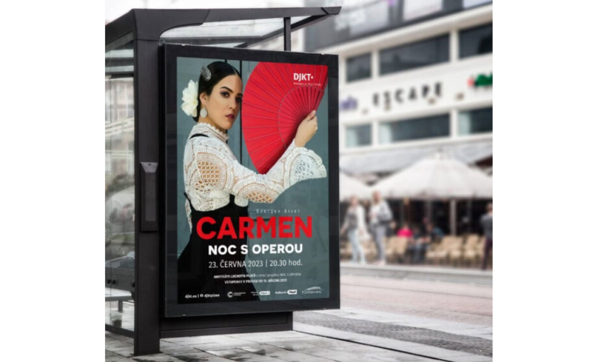
ATONdesign’s poster for the "Noc s operou" presentation of Carmen conveys the opera's fiery spirit and timeless drama. Through a striking central portrait, a focused color scheme, and layered typography, the design is both artistically engaging and effective for promoting this significant cultural event in Pilsen.
Anchored by a single, arresting photographic portrait of a woman as Carmen, the poster uses a high-contrast shot where her direct, defiant gaze captivates.
Her traditional attire and a flower in her hair are classic signifiers. A large, vibrant red fan she holds open partially conceals her face, creating mystery and making the composition dynamic and alluring.
The color palette is remarkably focused: a rich black and white composition is cut through by a single, vibrant red accent. This fiery red is reserved for the iconic fan and the "CARMEN" title. By stripping away all other colors, the designer maximizes red's symbolic association with passion and danger, the opera's central themes.
For a poster print design, this is a highly effective technique, as red is one of the most visible colors in the spectrum, second only to yellow, giving it an innate ability to capture people's attention instantly.
Layered and contrasting typography is another key strength. The "CARMEN" title, in a bold sans serif, is visually integrated into the scene. Supporting information is in a clean, all-caps sans-serif, ensuring the poster functions brilliantly as both art and advertisement.
A key insight from the Carmen poster is the strategic power of a severely limited color palette in creating dramatic impact. By using red as a single, targeted accent against a monochrome background, the design forces viewer focus and amplifies the symbolic weight of that color.


-preview.jpg)