Standout Features:
- Clean, structured layout with clear visual hierarchy
- Natural, environmental color palette reinforcing sustainable brand values
- Authentic photography and professional project imagery
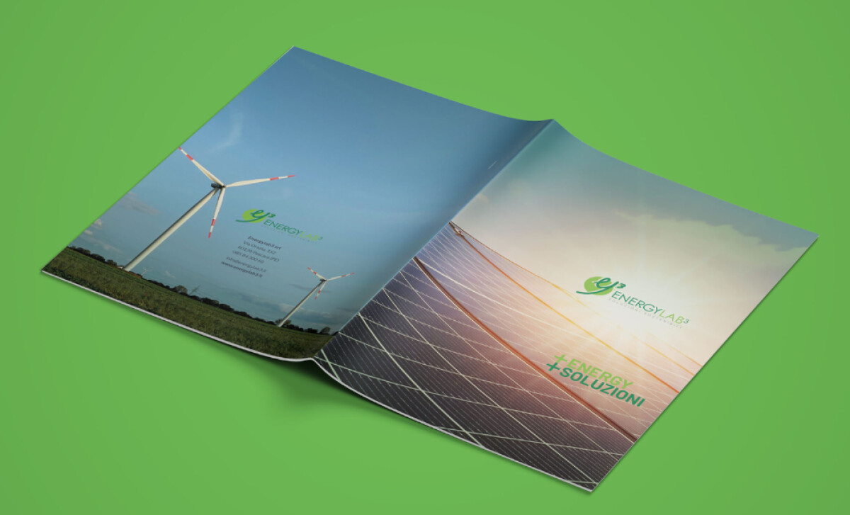
Red Cactus developed the catalog for EnergyLab3, a firm specializing in renewable energy since 2009. With a team of highly skilled professionals, EnergyLab3 aims for sustainable economic development. Its catalog design highlights this expertise and its role in promoting energy efficiency.
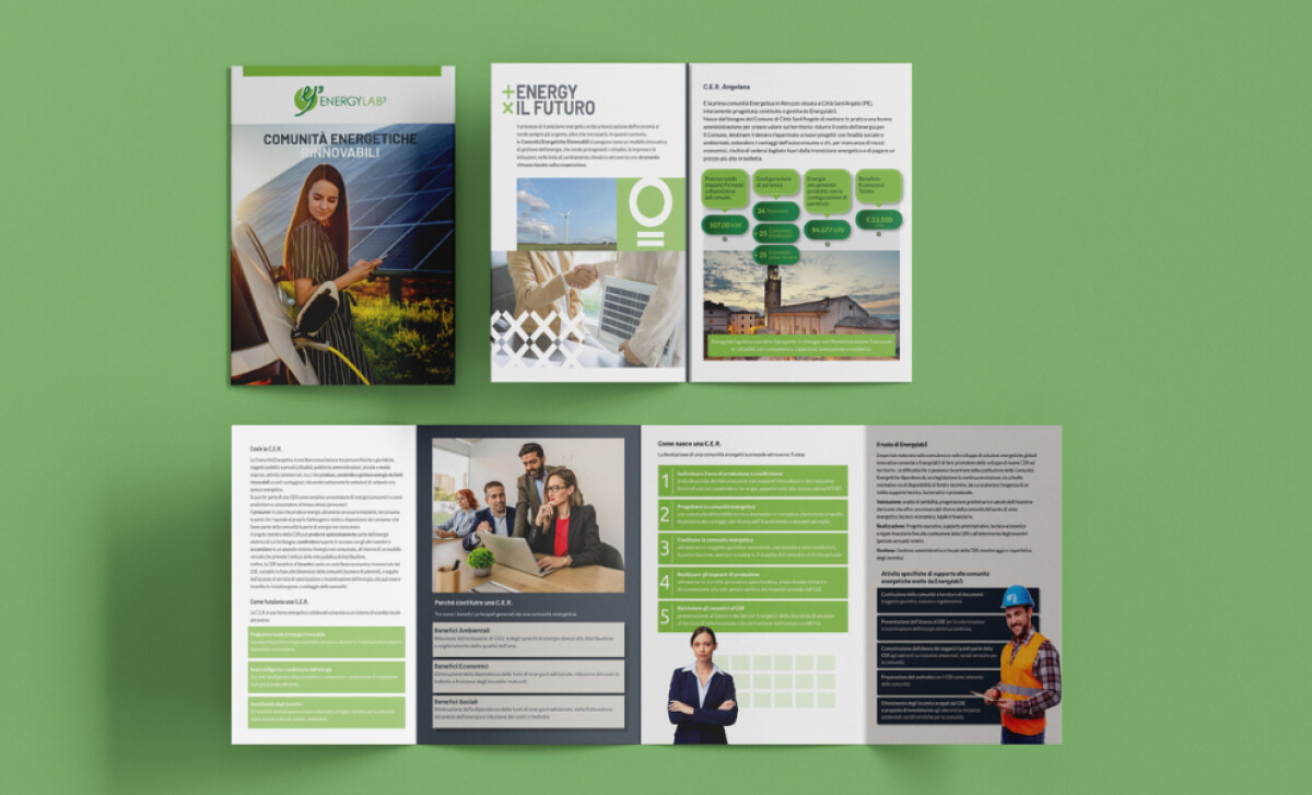
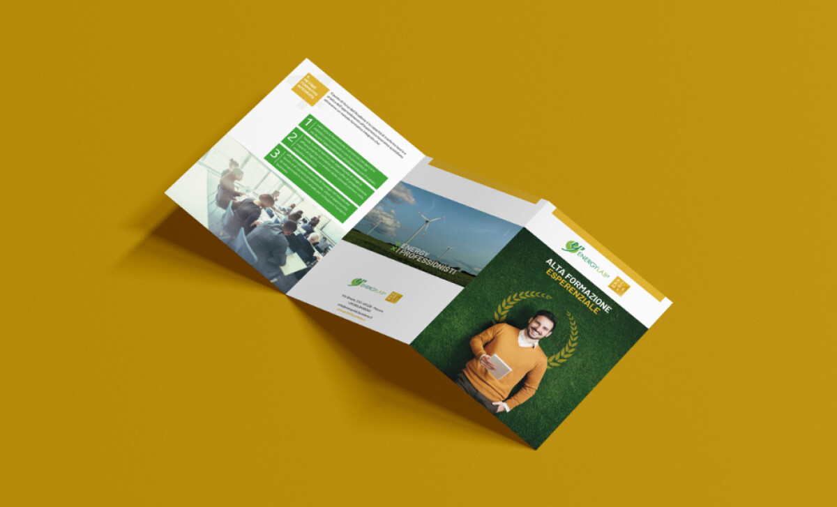
The catalog features a clean, structured layout. Content is divided into clear sections using distinct headers and easy-to-follow numbered lists. Shaded boxes in light green and grey tones effectively segment information, aiding quick scanning and ensuring key points stand out.
EnergyLab3’s print has a natural color palette, featuring shades of green complemented by soft greys and clean whites. Greens, from light lime to deep forest, visually connect to nature. This color choice is particularly apt, as research by Sun & Wu (2023) suggests that a preference for green can encourage sustainable consumption behavior.
Authentic photography and professional imagery are well-integrated. Full-bleed images of renewable energy projects are shown alongside candid shots of the team. This balance between showcasing technology and human expertise makes the company’s services feel both innovative and grounded in real-world application.
The design for EnergyLab3’s catalog highlights how a consistent and thoughtful visual hierarchy can guide readers through dense technical content with ease. The clear segmentation, use of numbered lists, and balanced interplay of text and images make the information digestible.