

Print Designed by
Public Eye Public Eye

Exposure Photography Festival

Exposure Photography Festival Print Design by Public Eye
Public Eye created the print identity for Exposure Photography Festival, an event centered on photography, visual storytelling, and artistic expression. The project establishes a contemporary and immersive festival presence designed to celebrate creative work, connect audiences with photography culture, and position the event as a dynamic platform for artistic and cultural engagement.
Colorful branding cards rest on a textured grey surface.
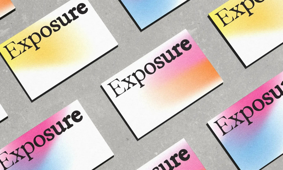
Gradient printed cards display the bold Exposure logo
Printed exhibition brochure displays bold typography and detailed schedules.
Unfolded festival guide features a bright yellow event map
This website uses a colour palette of 4 colours
  • #262729
  • #DCDCDC
  • #F764AB
  • #83BEE6
Technologies & Tools
Description
Team Behind the Design
  • Agency: Public Eye
  • Client: Exposure Photography Festival
  • Category: Print Design — Arts & Recreation
  • Location: Calgary, Canada
  • Project Brief: Create a print identity that reflects Exposure Photo’s focus on creativity, photography, and artistic visual storytelling.

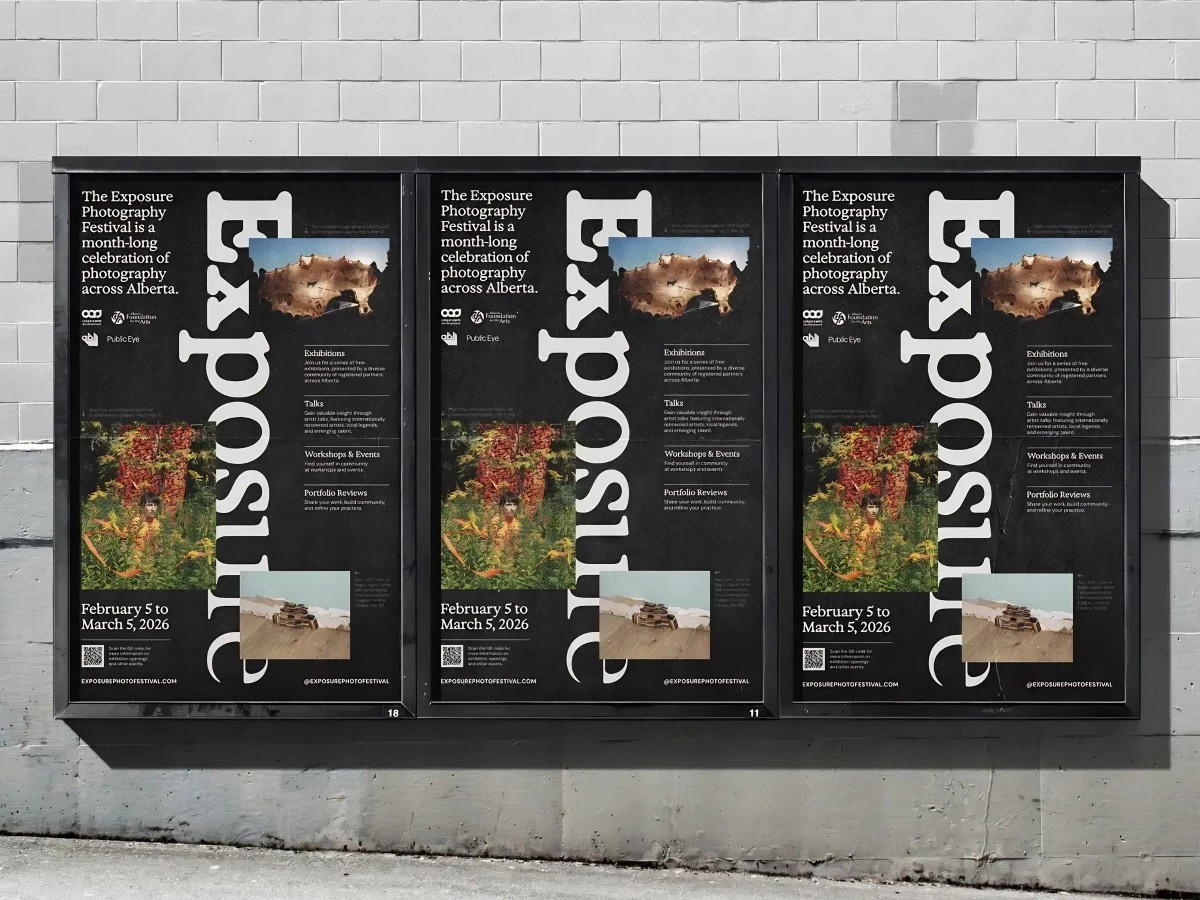
Print materials for a photo festival have to look like the work the festival is about to show you. Public Eye's identity for the Exposure Photography Festival in Calgary builds on one element. The word "Exposure" is set in a tall black serif and dropped at full bleed across every piece.

The poster series puts the wordmark on a black field, with three festival photographs floated across the layout at varying scales and slight angles. Programming details sit along the right edge in restrained sans-serif copy, keeping the visual weight on the images.

A set of postcard-sized pieces builds the system out through color. "Exposure" stamps the upper corner of each card while the rest of the surface fades through saturated gradients, yellow to white, pink to orange, blue to violet, that read like over- and underexposed frames.

The festival guide carries the same wordmark across a folded broadsheet. A yellow Calgary map marks 30+ venue pins alongside listings for exhibitions, talks, workshops, and portfolio reviews. It's arts and recreation print design doing two jobs at once: a working document for the festival, and a brand artifact that holds up next to the posters.

Vote for the best design in this year's Design Awards and help decide which projects deserve top recognition. Every vote contributes to celebrating creativity and craftsmanship across categories like web, branding, product, and digital design.
Exposure Photography Festival Print Design by Public Eye

Exposure Photography Festival

Designed byPublic Eye
Serious Play Print Design by Gebr.Silvestri

Serious Play

Designed byGebr.Silvestri
I Biscotti di Efren Print Design

I Biscotti di Efren

Designed byNotorious Agency
Imperial College London Print Design by The Click

Imperial College London

Designed byThe Click
Cure8 Print Design by Muse Muse

Cure8

Designed byMuse Muse
DRYBOSS Print Design by FIXGU

DRYBOSS

Designed byFIXGU
Outset Law Print Design by Wegrow

Outset Law

Designed byWegrow
WorkWhy? Print Design by Idyllic

WorkWhy?

Designed byIdyllic
View All BestPrint Designs

Ready to elevate your designs?