Standout Features:
- Playful doodle illustrations
- Clean layout with effective use of photography
- Consistent and professional branding
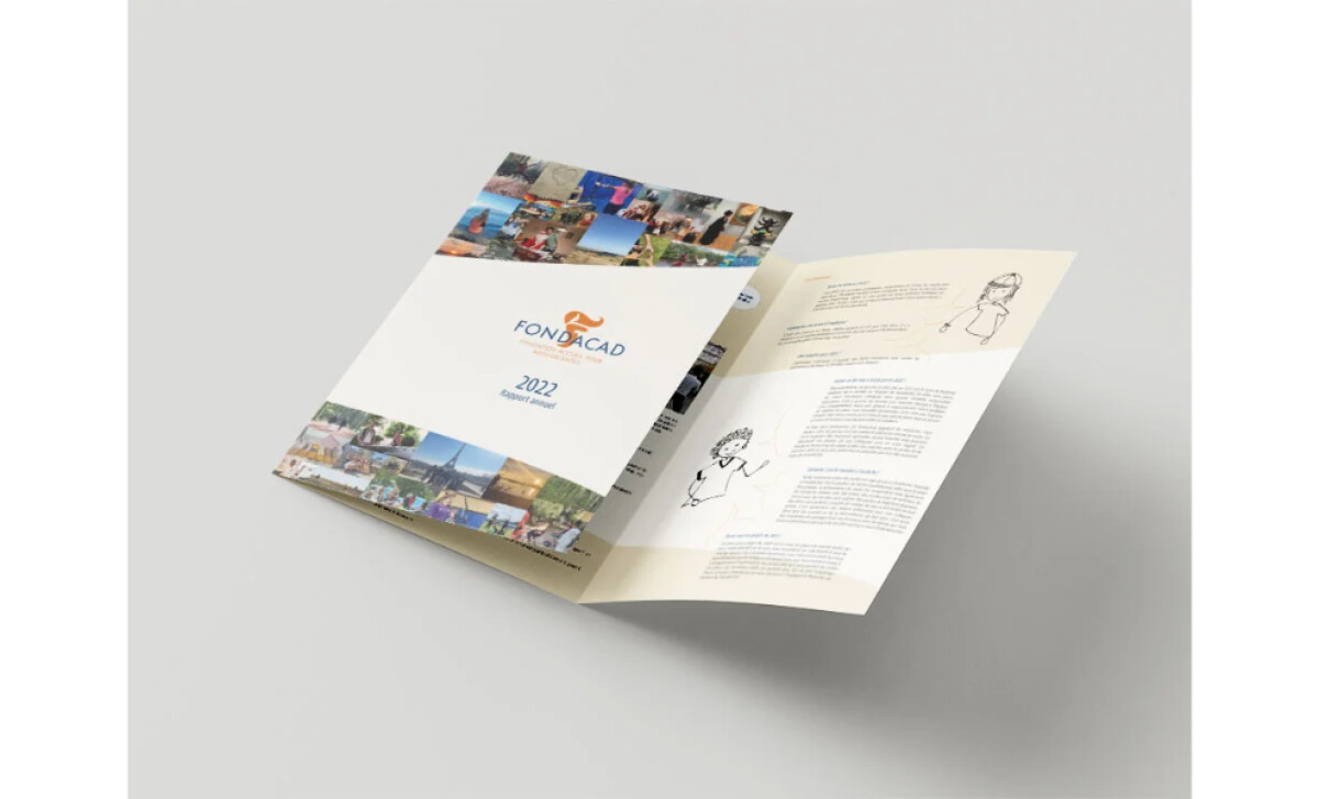
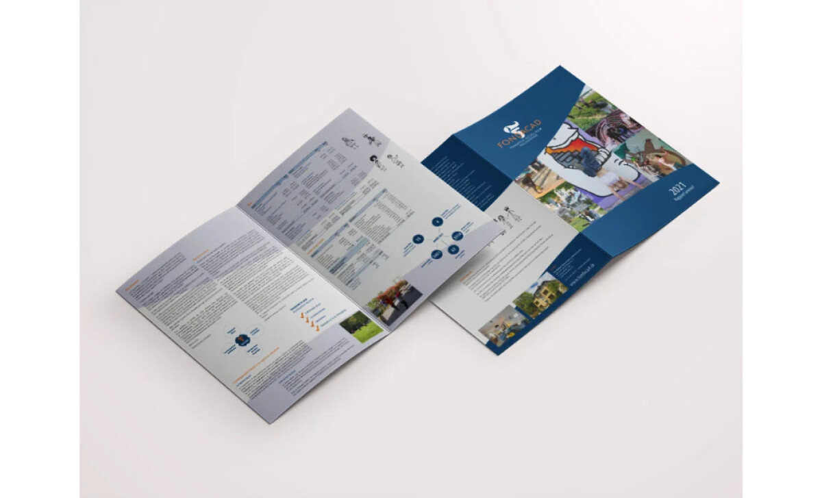
The FondAcAd brochure, designed by Pixandnet, is a beautiful example of how playful design elements can be used effectively in a professional context. The brochure showcases the mission and values of the Fondation Accueil pour Adolescentes, an organization that supports adolescent girls in challenging situations.
One of the standout features is the hand-drawn, squiggly line-drawing illustrations. These playful, informal designs humanize the content, making it more relatable, especially given the sensitive nature of the foundation's work. They contrast with the more formal content and help emphasize the human-centered approach of the foundation.

The brochure integrates real-life photographs that depict candid moments involving the adolescents the foundation serves. These photos are not overly stylized, providing an authentic connection to the foundation’s mission of care and support. The clean layout allows the images to breathe, ensuring that they are not overwhelmed by text.
Lastly, the branding across the brochure is clean and consistent. The soft blues and oranges enhance the brochure’s professionalism while remaining warm and inviting. This helps reinforce the foundation’s identity, ensuring that it aligns with the organization’s image as a stable and trustworthy source of support for vulnerable adolescents.
With all these features combined, this thoughtful design ensures that the message of care and support for adolescent girls is communicated effectively, making the brochure both engaging and impactful in its support of the foundation’s mission and values.

-preview.jpg)