Standout Features:
- Vibrant color palette
- Fun and unconventional layout
- Creative photo cutouts
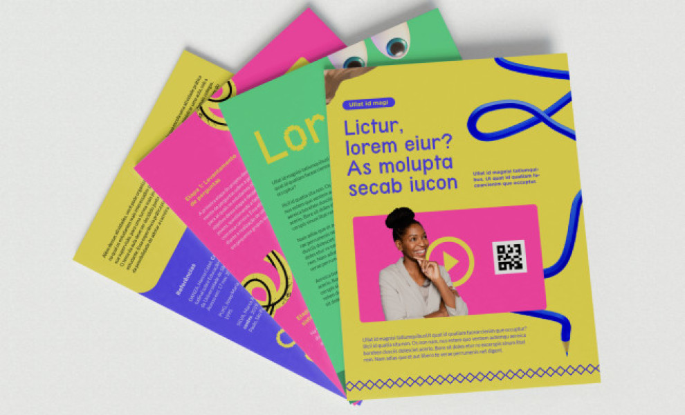
In this striking print design project for Revista Segue os Profs | Instituto Singularidades, Thayran Studio masterfully employs a palette of playful and vibrant visuals.
The color scheme features a mix of yellow, blue, and pink. These hues reflect the youthful energy of the student audience. They set an inviting and upbeat tone while ensuring the primary focus remains on the content.
One unique aspect? The design breaks from convention by adopting a magazine-style presentation. This choice feels nostalgic and fresh, with elements organized to encourage the reader to explore the page rather than scan it.
The layout also features impactful portraits surrounded by various cutout letters and icons. It's a modern and creative touch that adds depth and character to the prints!


-preview.jpg)