- Agency: Grávita
- Client: GOURNAY
- Category: Print Design
- Location: Madrid, Spain
- Project Brief: Produce print materials that reposition aesthetic medicine through clarity, restraint, and a more elevated, institutional visual language.
Print design in the beauty space often leans on visual excess and trend-driven styles. GOURNAY takes a different path, using restraint, typography, and composition to present aesthetic medicine as a more considered practice.
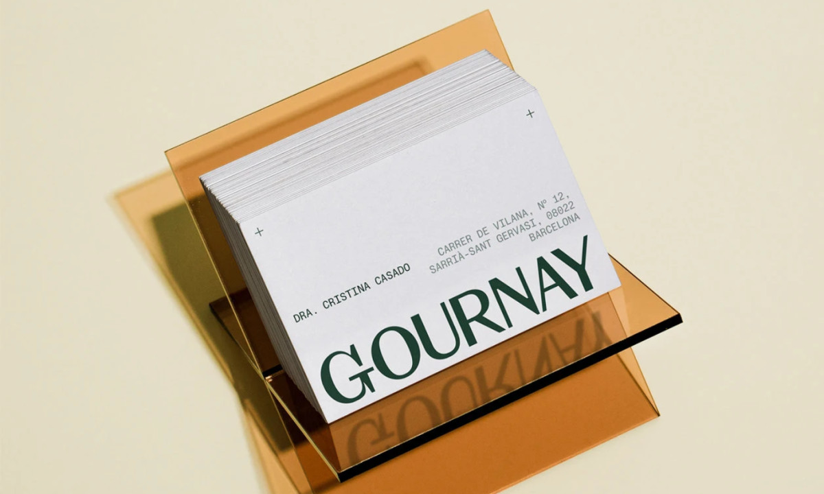
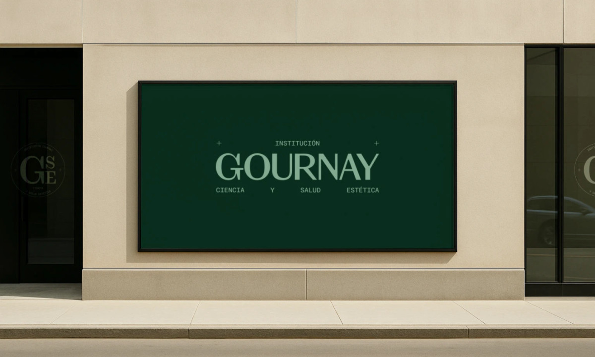
Typography establishes authority from the outset. A refined serif logotype anchors the system, while a restrained sans-serif supports it, creating a clear hierarchy that feels both modern and institutional.
Color choices reinforce this repositioning. Deep green and neutral tones replace conventional beauty palettes, helping the brand feel more aligned with health, science, and long-term credibility.
Structural details sharpen the overall tone. Registration-style plus marks sit at the corners of layouts, and dashed ruled lines cross the letterhead horizontally, borrowing the visual language of technical drafting to suggest precision and process.
The logotype scale is what makes the print system memorable, though. GOURNAY runs large across the base of layouts, pushing toward the edge of the page, so the wordmark reads less like a logo and more like part of the architecture itself.