A bright, colorful brochure showed off the 2016 season for Griffin Theatre Company. This inviting layout was designed by Re Design Studio.
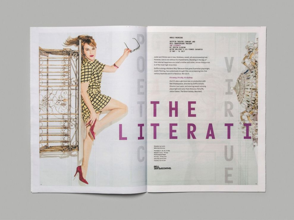
The shows are highlighted by a large photo that immediately grabs your eye. Using the name of the show, Griffin Theatre also connects some other words that pertain to the program in a sort of Scrabble-style, crossword layout. The added letters are a muted gray color so as not to distract from the actual title, which is bold and colorful.

The typography for the descriptive text is small. The designers clearly preferred that the images and the bold, title text be the focal points. Even the models in the photos are wearing bright colors to ensure that they will be noticed above all else.
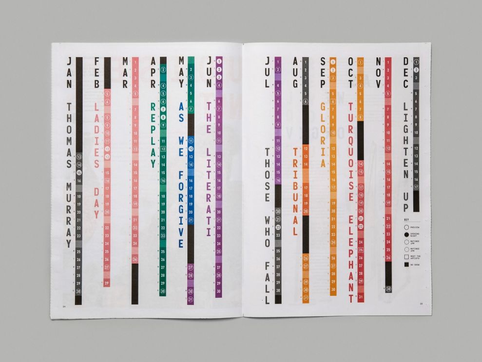
Everything in the brochure uses a burst of color to grab the attention of viewers. Even the show’s schedule does everything it can to jump off the page and make an impression. This attention to detail from cover to cover makes the Griffin Season 2016 brochure a pleasure to browse.
Griffin Season 2016 Brochure is a great print design in the Arts & Recreation industry.