These Hong Kong Ballet Prints Are Stunning, Sophisticated And Exciting
The Hong Kong Ballet is a prestigious dance company that brings together a team of artists with talent that is engaging, captivating and stunning.
One of the premier classical ballet companies in Asia, Hong Kong Ballet (HKB) is internationally recognised as a top institution that represents Hong Kong’s unique character. Since its inception in 1979, HKB has evolved into a vibrant performing arts organisation with a strong repertoire composed of a range of artistic and technically challenging productions, showcasing our exceptional dancers. One of Hong Kong’s most prominent performing arts groups, the Company is proud of its past and is excited for its bright future ahead.The Hong Kong Ballet is a world-renowned organization that is known for its talent and expertise. It’s a visual arts performance that can’t be ignored.
So when it was time to promote their new performance, they turned to a design studio to help them market their new message: “Never Stand Still.”
Design Army took on the challenge, creating a print poster campaign that blows our minds. Hong Kong Ballet’s unique character proudly embodies the dynamic vitality of its home city.
Washington-based design studio Design Army had this to say about the Hong Kong Ballet print campaign:
Design Army was approached to concept, design, and art direct the company’s 2018/2019 creative campaign, “Never Stand Still.” We looked to establish a vibrant, energy filled brand experience that reflects the passion and drive of dance, and the Hong Kong Ballet’s new artistic director, the highly acclaimed choreographer, Septime Webre. At the center of the work is the photography, shot in Hong Kong with dancers from the troupe. For the brand images, we created a visually stunning language speaking to the vibrancy and energy of the art form, the dancers, and the city itself. We designed a lush, rich world of fantasy through fashion, color, and typography — establishing a recognizable and dynamic brand language.These designs are fantastical, creative and powerful. They convey the brand, its language and its roots in an elaborate display of excellence and class.
These print posters don’t disappoint. In fact, they transform, revolutionize and spur to action in a way you’d never expect.

Hong Kong Ballet’s Print Posters Use Movement To Bring Images To Life
To usher in a new performance, the Hong Kong Ballet turned to a Washington-based creative studio to create a poster campaign that would draw eyes, and draw sales. And these print designs certainly pack a punch.
There's a dynamic quality to these prints that come from the movement captured by the photography. It's stunning and sophisticated and strong. These ballet dancers are performing acts and feats that not many people can accomplish, and it's eye-catching instantly.
Ballet in general an art based in movement. It requires attention to detail, practice and excellence and you can see dedication in the photography included on these print posters.
The way these ballet dancers bodies are shown is artistic and beautiful. They’re caught mid-action. They are hanging in the air; they’re moving across the screen; they’re jumping and flying and climbing.
By capturing this movement, the photographer behind these designs instilling within them movement that can't be ignored. It pulls viewers in and keeps them engaged.
These designs are surreal and attention-grabbing — they perfectly capture the essence of the Hong Kong Ballet’s new performance with excellence and class.
Not only are these designs engaging and moving, but they’re also fun. By creating this dynamic atmosphere you’re immediately interested.
You don't want to look away. In fact, you want to learn more. You might be able to guess what these print designs are about, but you don't know for sure. So you have to get a better look. You have to investigate and the movement in this design makes that so.
There’s no text in this design. It is simply a photograph, capturing an engaging, interactive and moving moment in times. It is a great example of how creative design experts are able to harness the power of visuals to communicate a message without relying on text.
These images and these dancers seem to jump from the page. It’s not necessarily three-dimension, but it is full of depth and it’s hard to miss.
The Hong Kong Ballet Images Are Striking, Stopping Viewers In Their Tracks & Adding Value To The Posters
Of course, the movement is powerful. This is a dance company, after all. And they’re promoting a performance. Therefore the design has to include movement. It has to include dance. It has to show viewers what they’re going to expect.
But another dimension that adds weight to this design are the situations that are captured in these prints. This isn’t your average poster campaign.
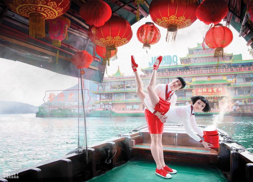
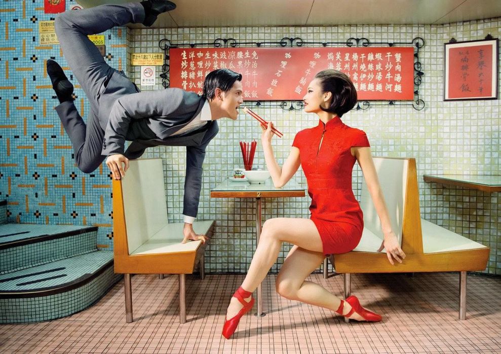
Dancers aren’t on a stage, they’re not performing acts in front of audiences. They are in seemingly normal situations that are elevated by the characters and their movement.
Of course, some of these designs put the dancers at center stage, set against a moody background. And these, too, are compelling. These images solely show these dancers performing fantastical displays of artistic talent. These situations are equally eye-catching — you can’t do what these professionals can and that is innately compelling.
But in the images set against cityscapes or in cafes — these images are enigmatic and transformative. These are simple, normal situations that are being turned on their head through movement and body placement.
And they catch your eye because they just don’t seem to belong.
There’s an oxymoronic quality to these designs — they’re exciting, yet soothing. They’re mysterious, yet blunt. And this duality is something that almost doesn’t sit right. Almost. But ultimately, it catches your fancy and pulls you in and suddenly, you’re buying tickets to the ballet.
Regardless of the situation, however, this imagery is powerful. It’s captivating in its simplicity, even though you can feel the raw talent, energy and work that went into them.
These print designs are the perfect solution for a dance company and a new performance. They change how you see ballet — it’s exciting, not dull. It’s creative, not traditional. It’s revolutionary, not outdated. And these designs heighten that awareness.
Hong Kong Ballet’s Print Designs Grab Viewers' Attention With Bold Color Choice
The new performance ad campaign that the Hong Kong Ballet is trying to promote is called “Never Stand Still.” This is clearly evident in the dynamic qualities interspersed throughout the design.
But another way it is heightened is through color and typography — more specifically, in the fact that there is little to no text included at all. This puts all the focus on the movement within, which was a clever design choice that certainly sells.
But another way these designs stand out and promote action is through the colors used — whether it’s in a backdrop or in the clothing worn by these dancers, they immediately strike a noticeable contrast to the design around them. When print designers use vibrant and contrasting colors both in the background and the subject, they create a sense of energy and movement that immediately captures attention.
Bright red and oranges, striking whites and blues and eye-catching yellow all make a statement — this is a performance that you don’t want to miss.
The color was used deliberately. It sets the stage and sets the mood. It evokes emotions and engages on a subconscious level. It reels users in and makes them stop in their tracks.
These colors were also chosen because of their significance to Chinese culture, further promoting the brand and its roots.
The colors here make an impact and stick with you. They obviously flow well with the design but stand out just enough that you notice. They are just enough for you to care to learn more.
Color is powerful, and this design harnesses it.
Find more campaign inspiration, visit the Best Print Design section on DesignRush.

Hong Kong Ballet’s Campaign Designs Are A Dynamic Display Of Artistic Brilliance And Photographic Mastery
These designs are bright, bold and bombastic. They stick with you long after you’ve looked away, evoking a deep emotion that makes you want to learn more and maybe even attend.
They change the way people traditionally see the ballet. Thanks to these posters, the ballet isn’t something that’s boring, outdated and dull. No, the ballet is exciting. It’s dynamic. It’s a creative display of otherworldly talent and art.
The ballet is for everyone — and you can see that through the themes these posters tackle, the bright and bold colors used, the situations they highlight and the movement that seems unnatural and innovative.
These designs are brilliant and masterful. The photography that went into them is compelling, original and stunning. These designs tell a story and get across a message of movement and excitement, and it’s simply too gorgeous to look away from.
These posters are timeless and elegant. They capture a history and a brand message that goes back decades. This is a company that is known worldwide for its innovative performances and captivating shows. And these designs promote those messages beautifully.
These are modern, fresh and exciting. They’re playful and engaging. They pop. They excite. They transform.
That’s a lot for a simple poster, but you’d be surprised how powerful print designs can be. They can change perceptions with ease — and these do just that.
Need help creating outstanding print designs for your business? These graphic design agencies can help!