- Agency: Anatomy
- Client: Horniman Museum & Gardens
- Category: Print Design — Arts & Recreation
- Location: London, United Kingdom
- Project Brief: Create print design that repositions Horniman Museum & Gardens through bespoke typography, authentic photography, and a community-focused visual identity.
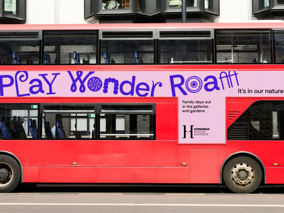
Most museum campaigns want you to picture quiet halls and glass cases. The Horniman Museum & Gardens, rebranded by Anatomy for its "It's in our Nature" push, goes the other way and builds a whole alphabet out of the stuff inside the collection.
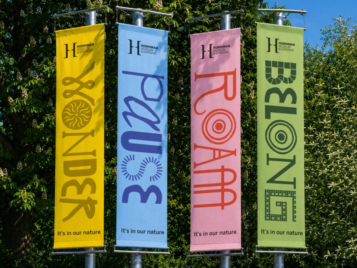
Look closely at the type and you start spotting things: a shell, a string of beads, a coil of rope, a patch of mosaic tiles, each one standing in for a letter. This is arts and recreation print that rewards a second look, with words like WONDER, ROAM, and BELONG running straight down the banners, so reading one feels a little like wandering the galleries yourself.
Color carries the mood. Bright yellows, blues, pinks, and greens bounce across the flags, a bus wrap, and the merch, and the whole thing feels made for families on a day out rather than scholars taking notes.
It looks great on a cap or a tee too, where "WONDER" or "I am the Walrus" becomes something you'd actually wear. The one snag is reading it from a distance, since those object-letters that charm you up close can turn a single word into a guessing game from across the street.