Interdeco Print Design by Brandsbyjp
Interdeco’s visual identity was designed to reflect clarity, quality, and modern residential construction. A minimalist house-inspired mark conveys simplicity and trust, paired with a contemporary typeface for balance and precision. The copper-ore-inspired green palette references Chile’s mining heritage, giving the brand a distinctive, sophisticated presence.
Stationery system showcases refined copper-green palette
Architectural poster highlights minimalist brand identity
This website uses a colour palette of 4 colours
  • #8CA097
  • #345A5B
  • #273536
  • #B27554
Technologies & Tools
Description
Team Behind the Design
  • Agency: Brandsbyjp
  • Client: Interdeco
  • Category: Print Design — Real Estate
  • Location: Chile
  • Project Brief: Develop a cohesive real estate print identity for Interdeco that communicates trust, modern construction expertise, and architectural precision.

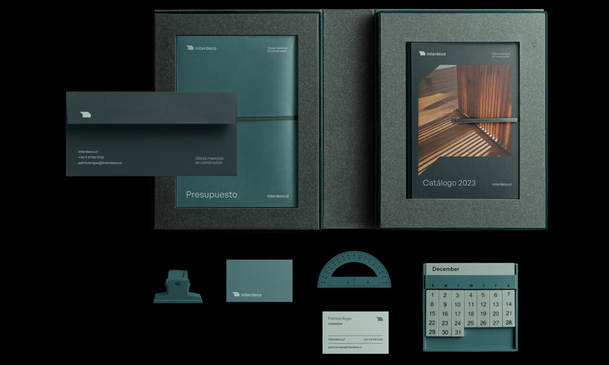
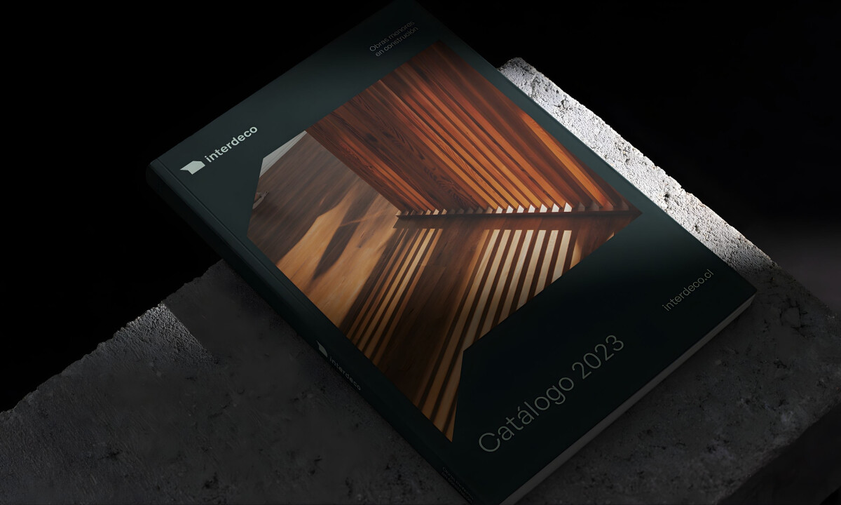
A refined real estate print design communicates trust and professionalism before a project even begins. Interdeco combines a minimalist architectural mark, clean typography, and a copper-inspired green palette to express quality, precision, and modern residential construction.

Ready to elevate your designs?