- Designer: Rafael Cardoso
- Client: JGroup
- Category: Print Design — Professional Services
- Location: Belo Horizonte, Brazil
- Project Brief: Create print design that translates JGroup’s vibrant visual identity into cohesive materials through clear layouts, refined typography, and consistent brand communication.
Professional services print work tends to play it safe with a tidy logo and a clean grid. JGroup, a beauty PR agency rebranded by Rafael Cardoso, blows that up by turning a single letter J into a giant, magazine-scale graphic.
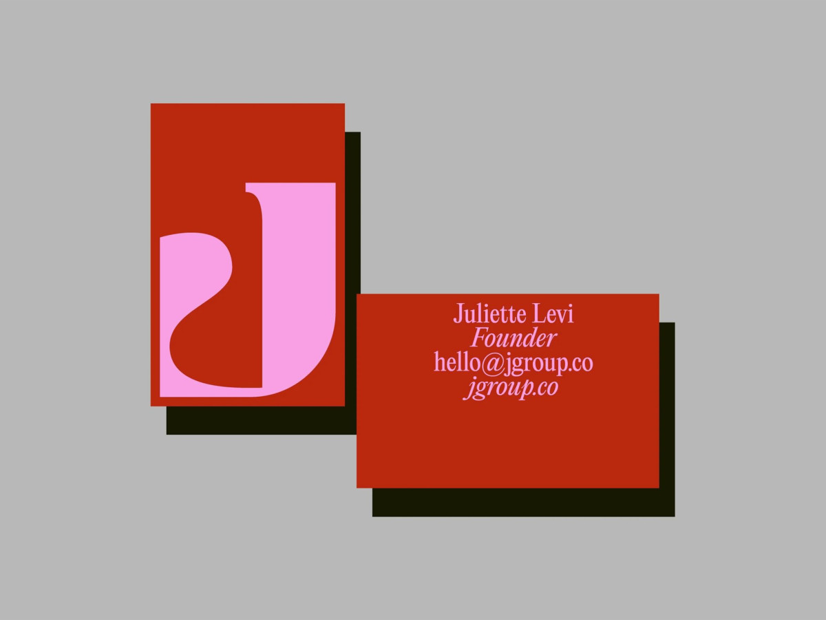
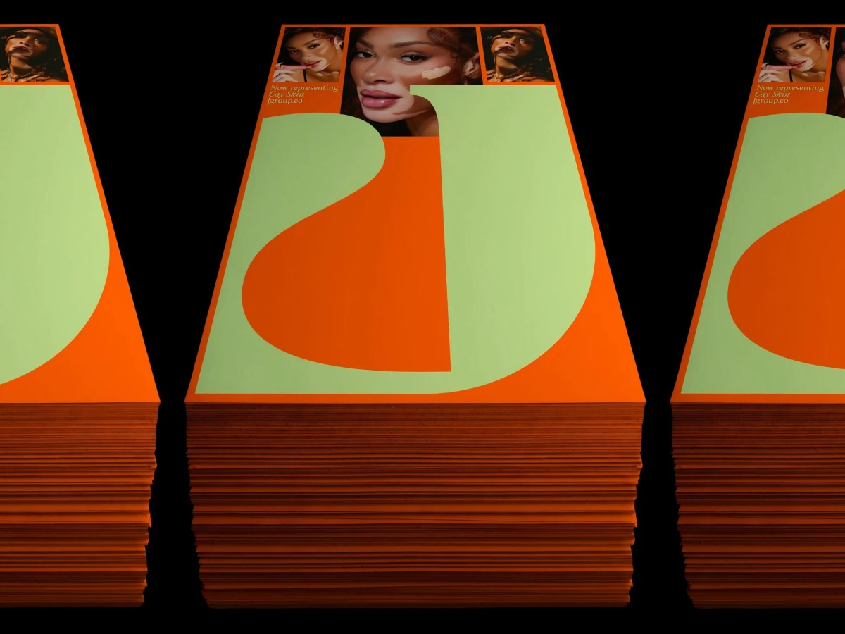
The oversized J is the whole system, its curved bowl carved out of flat color so the letterform doubles as an abstract shape. It flexes across scales, filling a poster, wrapping a tote, and shrinking onto a business card, always cropped bold enough to read as an image before a letter.
The color choices sell the "solar" idea with real nerve, pairing lime and orange on one piece, red and pink on the next. Those clashing duos plus editorial serif type nod to the agency's print-journalism roots without leaning on a newspaper cliché.
The confidence is the strength and the gamble at once, since a brand built on one letter lives or dies on that mark carrying every touchpoint. It looks striking stacked on a table or blown up on a billboard, though the J leans so far into abstraction it can read as a random swoosh before the name lands.