Standout Features:
- Elegant typography with a subtle serif font
- Sophisticated color palette
- Minimalist design for clarity
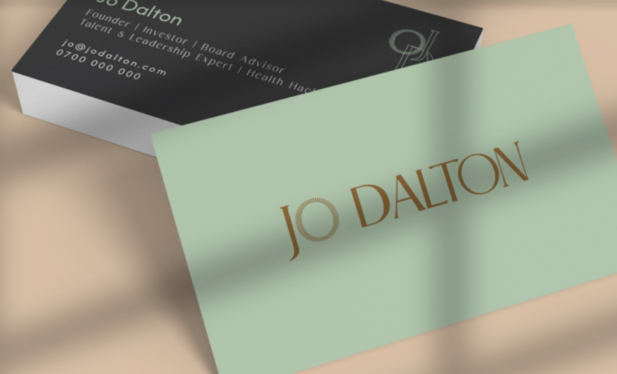
Jo Dalton, founder of JD&Co, sought to elevate her social media presence and brand storytelling as a talent & leadership expert. To achieve this, Ferrgood Studio provided a comprehensive refresh of her personal and business brand, culminating in a refreshingly clean business card design.
Jo Dalton's new business card boasts a dual color scheme. The front utilizes a sophisticated, near-black card stock, which is beautifully contrasted by a lighter, softer back. This deliberate contrast ensures text clarity and impactful communication. Plus, it makes the business card more memorable and interesting no matter what side.
The card's elegance is further enhanced by its typography. Notably, the lighter back of the card features a refined font with subtle serifs for "Jo Dalton." This font choice resonates with the high-caliber nature of her work as a talent and leadership expert, investor, and board advisor.
Complementing these features is a minimalist layout. Essential information — name, contact details, and professional titles — is presented clearly and concisely. This no-nonsense approach reflects the efficiency and professionalism Jo Dalton promises her clients.
For professionals and businesses in the service sector, a business card design conveying such professionalism is indispensable for making a lasting first impression.