Standout Features:
- Captivating food imagery
- Clean and structured layout
- Simple typography
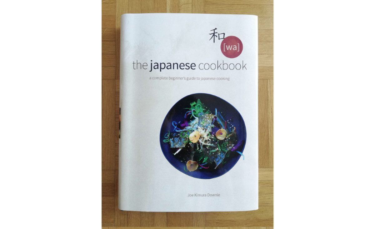
The Japanese Cookbook, designed by Geoff Borin, not only educates but also embodies the elegance and simplicity of Japanese culture. The print is a visually stunning and practical culinary guide that beautifully marries flavor complexity with an approachable aesthetic.
The cover features a single Kanji character, "和," meaning "harmony." This focal point is a masterful stroke that immediately communicates the book's cultural context. An accompanying snapshot of a dish serves as a visual shorthand for the richness of Japanese cuisine. It piques the reader's interest and invites them to delve deeper into the pages!
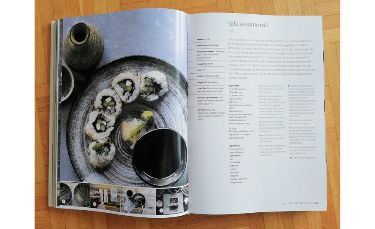
Inside the Cookbook, the layout is thoughtfully structured. Each page is meticulously organized, with a clear hierarchy that guides the reader through recipes, tips, and cultural insights. The layout enhances the reading experience by balancing text and imagery. It also applies the clean and orderly nature of Japanese design principles.
Clean typography is a hallmark of good design. The simple, uncluttered design reflects the elegance and minimalism of Japanese aesthetics, creating a visually appealing and easy-to-navigate cookbook.
To top it off, the cultural imagery throughout the Cookbook further enriches the reader's experience. Authentic photographs of dishes, ingredients, and traditional Japanese kitchen scenes bring the recipes to life. This artistic take makes the book equally informative and visually stunning.