- Agency: Brainmetal Design
- Client: Kairos Pharma
- Category: Print – Medical & Pharmacy
- Location: Toronto, Canada
- Project Brief: Develop a print design system for a clinical-stage biopharmaceutical company that communicates credibility, scientific rigor, and innovation across professional touchpoints.
In evaluating medical and pharmaceutical print systems, I look at how abstraction, hierarchy, and restraint can translate complex science into confidence.
The Kairos Pharma print design succeeds by respecting the intelligence of its audience while presenting a highly controlled visual language.
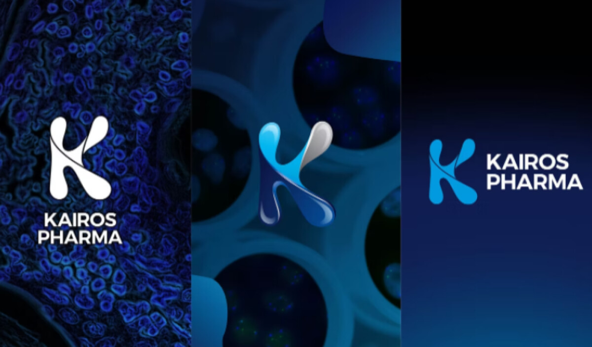
- Visual Narrative: I’m drawn to the biomorphic abstractions that run through the system. The forms hint at cellular and molecular structures without spelling them out, which keeps the visuals proprietary and intellectually engaging instead of instructional.
- Color Strategy: A controlled dark-to-light contrast sets the tone. Deep navy and near-black create seriousness, while luminous blues introduce clarity and momentum without slipping into the optimistic tropes common in health branding.
- Logomark Design: The sculptural “K” sits comfortably between organic and engineered. Soft geometry suggests biology, while its precision signals scientific control, which feels well suited to oncology-focused research.
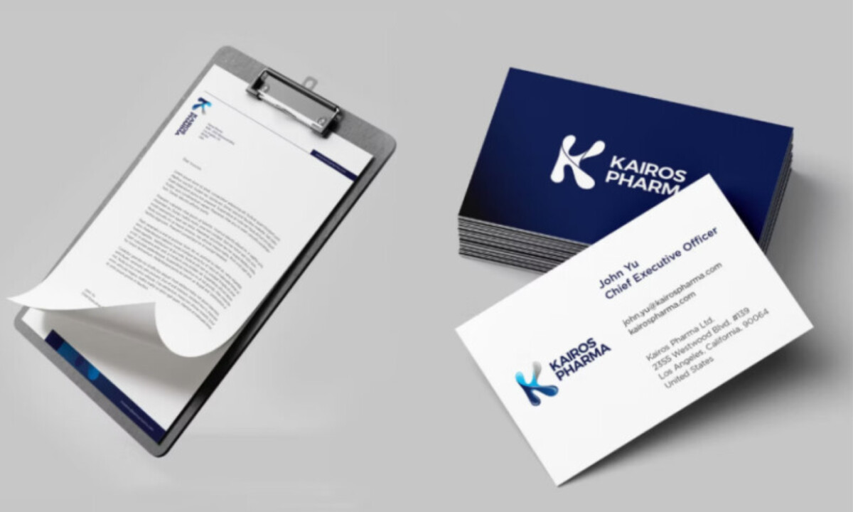
- Typography & Hierarchy: The sans-serif typography is disciplined and clear. I like how spacing and structure help dense information feel more manageable, which matters for clinical, investor, and research-facing materials.
- System Consistency: Across signage, stationery, and large-format print, the identity holds together cleanly. That consistency reads as maturity and reliability, especially for a company operating in clinical stages.
What Brands and Agencies Can Learn from Kairos Pharma
1. Use Abstraction to Communicate Advanced Science
Abstract visual systems can suggest innovation and depth without overwhelming audiences with literal diagrams or technical imagery.
2. Let Contrast Do the Heavy Lifting
Dark foundations paired with controlled highlights help medical brands feel focused, authoritative, and memorable in professional environments.
3. Design Print Systems, Not Isolated Assets
Consistency across formats — from business cards to architectural signage — builds trust and signals organizational discipline.