- Agency: Pepper Group
- Client: Kensing
- Category: Print Design — Manufacturing Print
- Location: Palatine, Illinois, United States
- Project Brief: Produce a print design system that communicates Kensing’s new brand identity and organizes complex product information for a fast market launch.
Kensing didn't exist as a brand four months before launch. The company, formed through an industrial acquisition, took a name from the facility's address on Kensington Avenue, and needed a complete manufacturing print identity before the new entity went to market. Pepper Group built it from zero with no internal marketing team on the client side.
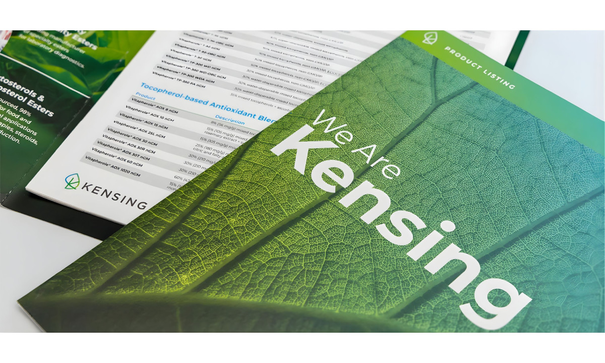
The print system covers the full physical environment. Architectural signage, environmental graphics, interior wayfinding, and branded collateral all launched within the same four-month window.
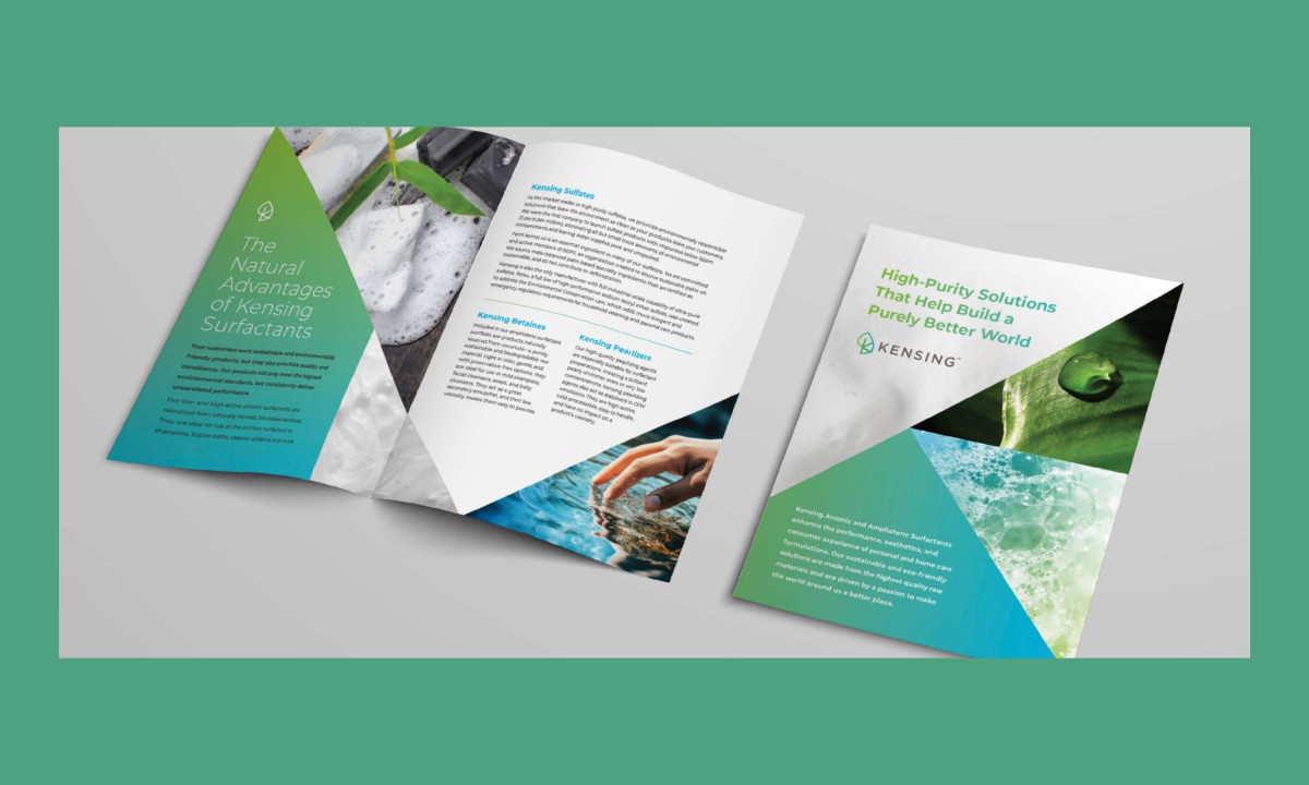
The visual language runs on high-contrast typography and a restrained color palette that modernizes the facility without hiding what it is: a working manufacturing plant.
The naming decision anchors the whole identity. "Kensing" comes from Kensington Avenue, the street where the facility sits. Pepper Group turned a geographic shorthand into a brand name, then carried that origin story across every printed surface. The place-based naming gives the brand specificity that most post-acquisition identities lack.
The wayfinding and interior signage move visitors from the building exterior through to executive spaces with consistent branding at every transition point. For a manufacturing facility hosting clients and partners, that environmental consistency signals operational control before anyone opens a capabilities deck.
Pepper Group delivered a complete manufacturing print identity on a timeline most agencies would use for a logo alone. Four months, no existing brand assets, no client marketing staff. The system works because every piece was designed to launch together, not to be perfected individually.