Team Behind the Design
Print Design Analysis
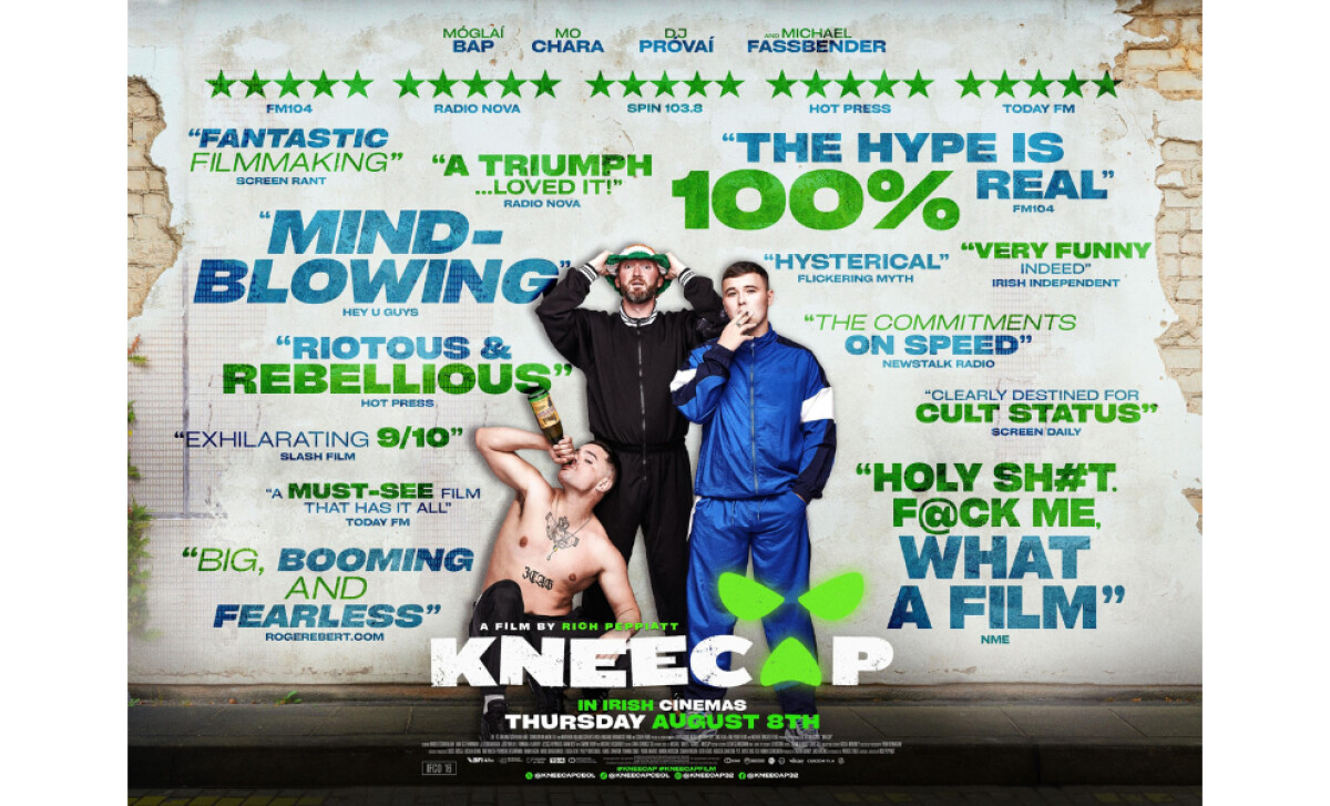
With posters, I look at how fast they hit. The image, type, and layout need to work together so the message lands in seconds, not minutes.
The Kneecap poster achieves this confidently. Here are some highlights:
- Imagery: The subjects are not posed like film leads but folded into the noise, reinforcing the film’s anarchic tone over polished star power.
- Typography: Oversized, all-caps quotes scatter across the poster like tabloid headlines. This amplifies hype and mirrors the film’s brash, unfiltered identity.
- Layout: Despite the noise, hierarchy is intact: the title and release date sit anchored at the bottom in high-contrast white and green, impossible to miss.
- Production Quality: Designed for large-format display, the poster holds its impact at scale. The textures and contrasts feel just as sharp up close as they do from across the street.
What Brands & Agencies Can Learn from Kneecap
The Kneecap poster proves how print design can distill a film’s identity into a single striking image that lingers with the viewer.
1. Imagery Can Carry the Story Instantly
The raw photography captures the film’s rebellious tone without explanation. Strong imagery allows an audience to feel the attitude of a story before they know the details.
2. Typography Should Speak with Confidence
The unapologetic type treatment anchors the poster and sets its voice. When typography carries personality, it becomes just as memorable as the visuals around it.
3. Layout Directs the Eye with Purpose
Every element in the composition leads back to the film’s title and details. A poster that guides attention clearly ensures its message is understood at a glance, whether up close or across the street.
About DesignRush Featured Designs
At DesignRush, we review hundreds of agency projects every month. Print designs like Kneecap stand out for their bold visual direction, relevance, and execution.
The most compelling pieces often advance to our Monthly Design Awards.
Explore standout print design projects and related categories here:
- Best Print Designs
- Best Website Designs
- Best App Designs
- Best Logo Designs
- Best Packaging Designs
- Best Video Designs
For a full list of design agencies and related services, see our Agency Directory.