Team Behind the Design
Print Design Analysis
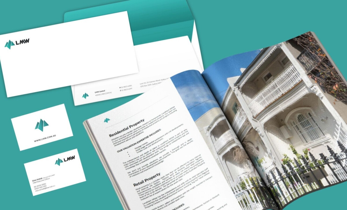
When I review professional services print systems, I focus on whether the design builds trust through structure rather than decoration.
LandMark White’s print work succeeds by staying disciplined, with every choice feeling intentional, functional, and aligned with institutional expectations.
- Hierarchy: I appreciate how the stationery system establishes order through white space rather than visual weight. Logo placement is consistent and understated, allowing content to take priority. The hierarchy reads immediately, which is exactly what’s required for formal correspondence and advisory documentation.
- Color: Teal is used with restraint, and that’s what makes it effective. Instead of dominating the page, it appears as a structural guide — rules, accents, and interior envelope details. This controlled application reinforces brand recognition without distracting from the information.
- Layout: The publication spreads show a clear editorial mindset. Pairing full-bleed architectural imagery with structured text pages creates balance between context and detail. I like how the design allows images to support the message rather than compete with it.
- Typography: Typography here is intentionally neutral, and that works in the brand’s favor. Clear sans-serif styling, generous line spacing, and controlled text widths reinforce objectivity and readability. Nothing feels performative—everything is built for clarity and endurance.
- Print Practicality: What stands out most is how well the system anticipates real-world use. From envelopes to multi-page documents, the layouts feel stable and repeatable. This kind of consistency is essential for firms operating across multiple client types and regulatory environments.
What Brands & Agencies Can Learn from LandMark White
1. Let Structure Communicate Credibility
In professional services, clarity and order matter more than visual flair. This project shows how spacing, hierarchy, and repetition can build trust without overdesigning.
2. Use Brand Color as a System, Not Decoration
Restrained color application creates longevity. When color is treated as a structural element, it supports recognition while keeping the content authoritative.
3. Design for Real Documents, Not Just Mockups
Print systems must work in physical environments. Anticipating folds, margins, and reading behavior is what separates polished concepts from practical execution.
About DesignRush Featured Designs
At DesignRush, we review hundreds of agency projects each month. The featured selections stand out for clarity, creativity, and execution across digital and brand experiences.
Exceptional works proceed to our Monthly Design Awards, where they’re recognized as leading examples of design craft.
Explore standout print design projects that push creativity forward:
- Best Print Designs
- Best Website Designs
- Best App Designs
- Best Logo Designs
- Best Packaging Designs
- Best Video Designs
For a full list of design agencies and related services, see our Agency Directory.


-preview.jpg)