- Agency: Principal
- Client: Ligne
- Category: Print Design — Architecture
- Location: Montreal, Canada
- Project Brief: Refresh Ligne's magazine identity and editorial design to broaden its readership while preserving its established voice in design and architecture.
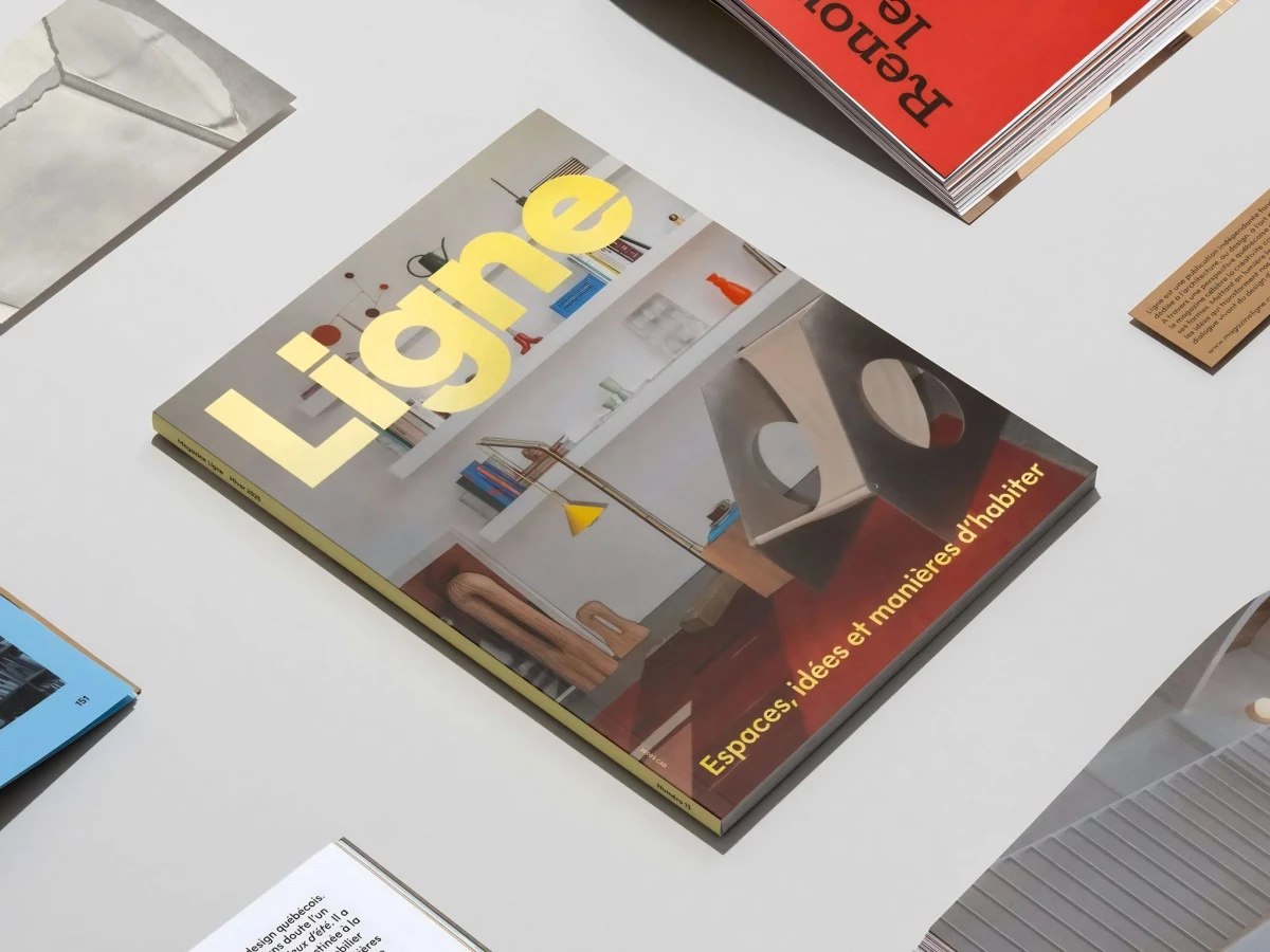
An architecture magazine tends to signal seriousness with cold restraint and a lot of white space. Principal took Ligne the other way, giving the Quebec title a heavy, oversized wordmark and warm, tactile layouts that make design feel open rather than exclusive.
The logo carries the whole repositioning. A chunky "Ligne" printed in gold foil and blown up large sits confident and friendly on the cover, so a broader reader picks it up without feeling shut out of an insider club.
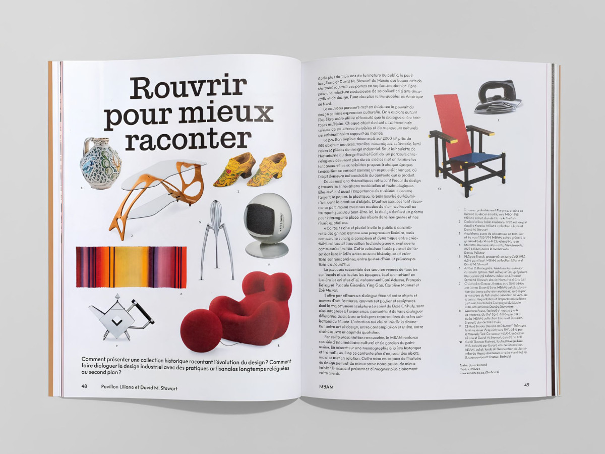
The editorial system flexes across very different spreads. Full-color object grids, dense French body text, and bold pull quotes set on flat fields of pink or red keep long architecture features moving like a magazine instead of a textbook.
The rebuild reads as one voice from cover to page. The same weighty type, warm palette, and generous scale carry from the foil logo into the interior, which gives Ligne the confident, lasting feel of a title meant to grow its audience.