Print Designed by
andstudio andstudio

Lithuanian Culture Institute

Lithuanian Culture Institute Print Design by andstudio
The Lithuanian Culture Institute promotes Lithuanian culture and professional arts worldwide, creating opportunities for collaboration between artists, cultural organizations, and international audiences. andstudio developed a new identity around the idea of cultural resonance, expressing how Lithuanian creativity travels across borders, sparks connections, and strengthens global cultural exchange
A wooden pallet holds stacked cardboard boxes featuring colorful pixelated graphics and "Lithuanian music in export" text.
Branded shipping boxes imply dynamic Lithuanian cultural export
A split image displays a person in a pixelated heart t-shirt beside a tear-off open call flyer.
Pixelated merchandise and flyers suggest modern grassroots cultural outreach
This website uses a colour palette of 4 colours
  • #8962E6
  • #22BE50
  • #BCDA54
  • #71AFD7
Technologies & Tools
Description
Team Behind the Design
  • Agency: andstudio
  • Client: Lithuanian Culture Institute
  • Category: Print Design — Education
  • Location: Miami, Florida, United States
  • Project Brief: Create a print identity that strengthens the Lithuanian Culture Institute’s international presence and cultural communication.

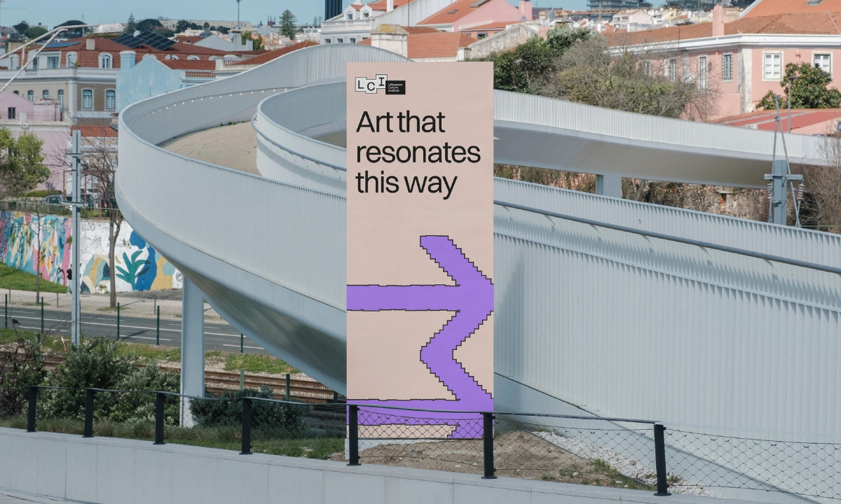
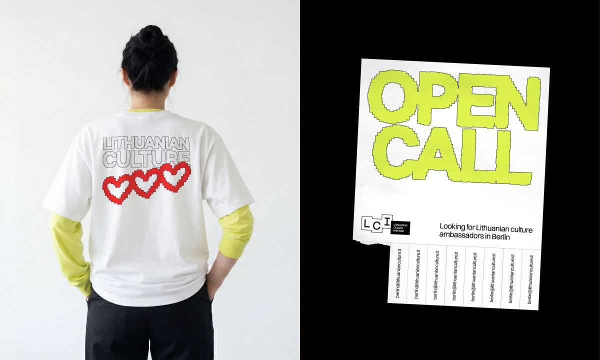
An print system for a national culture institute should travel as well as the work it represents. andstudio builds the Lithuanian Culture Institute identity around a single device, a pixelated digital brush that scales from tear-off poster to shipping crate without losing the through-line.

The pixel language carries the resonance metaphor without spelling it out, reading as both waveform and folk-pattern grid depending on the surface it lands on. That dual reading lets the system handle wayfinding, cultural symbolism and pure typographic shout from the same toolkit.

Color does the segmentation the layouts deliberately don't. Purple, lime green, blue, and red rotate across applications while the pixel grid, the bracketed LCI lockup and a stylized display face hold the system together, so the institute can run dozens of campaigns without commissioning a new identity each time.

Substrate choice is where the education print design discipline shows. Raw kraft cardboard for export, white t-shirts for ambassadors, torn-edge posters for open calls, each material reads as deliberately low-budget public communication rather than embassy gloss, which matches an institute that wants to feel current rather than ceremonial.

Explore this year's Design Awards finalists and see the projects selected for top recognition. These entries are now in the finalist stage, moving forward for jury evaluation across categories like web, branding, product, and digital design.
DRYBOSS Print Design by FIXGU
DRYBOSS
Designed byFIXGU
Imperial College London Print Design by The Click
Imperial College London
Designed byThe Click
I Biscotti di Efren Print Design
I Biscotti di Efren
Designed byNotorious Agency
Exposure Photography Festival Print Design by Public Eye
Exposure Photography Festival
Designed byPublic Eye
Serious Play Print Design by Gebr.Silvestri
Serious Play
Designed byGebr.Silvestri
View All BestPrint Designs

Ready to elevate your designs?