- Agency: Weast Coast Studio
- Client: Loners
- Category: Print Design — Entertainment
- Location: Newberg, Oregon, United States
- Project Brief: Create a card game design that combines engaging gameplay, memorable characters, and a distinctive visual identity.
Print design for entertainment lives or dies on shelf presence, and Loners grabs it with both fists. Weast Coast Studio gives this knuckle-busting card game a loud, cartoon-punk look that tells you exactly how rowdy the play is before you read a single rule.
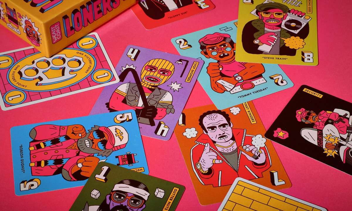
The illustration carries the brand. Every crew card is a grotesque street-tough portrait, Bobson Dugnut, Sloppy Sue, Tommy Tuesday, drawn in thick black outlines and clashing flats, so a fanned hand reads like a lineup of back-alley misfits. The style stays consistent across 51 cards without any two characters blurring together.
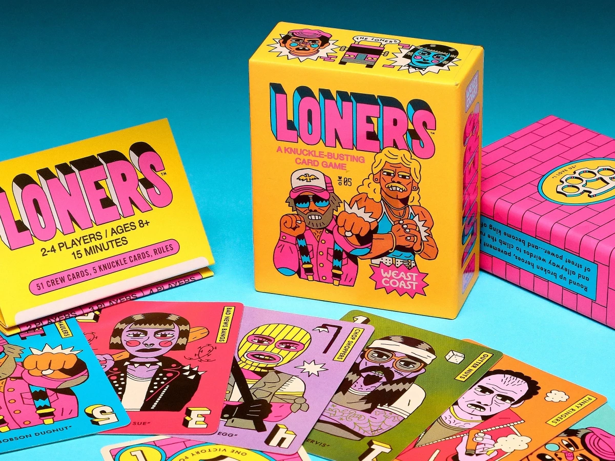
Color does the heavy hauling. Hot pink, acid yellow, and electric blue collide on a yellow box wrapped in brick texture, a palette that feels closer to a punk flyer than a typical family card game.
The system holds from box to table. The same loud type and characters run across the packaging, the rulebook, and the cards in play, so the whole thing photographs like one chaotic world. For an entertainment product fighting for attention on a crowded shelf, that commitment to a single bold voice is the win.