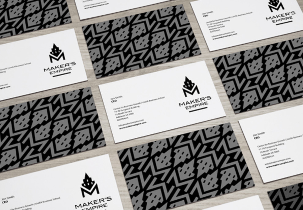
Standout Features:
- Monochromatic colors
- Bold, geometric pattern
- Prominent logo placement
The Maker's Empire business cards present a sleek, impactful design with monochromatic colors that convey sophistication.
The cards, designed by Jacques Pretorius, feature a bold, geometric pattern that gives them a contemporary edge. Meanwhile, the prominent placement of the logo featuring a stylized castle indicates a focus on creativity and construction.
This design ensures a memorable brand identity that stands out, using a black-and-white color scheme that offers a classic, versatile appearance suitable for various professional contexts. This design choice delivers a striking contrast that's both memorable and sophisticated.
Get a chance to become the next Design Award winner.
SUBMIT YOUR DESIGN


_b0b117d603f4-preview.jpg)