- Agency: Foye Design
- Client: Medik8
- Category: Print - Professional Services
- Location: Maidenhead, United Kingdom
- Project Brief: Produce professional services print reports that translate Medik8’s sustainability data into clear, credible visual narratives supporting its journey toward B Corp certification.
In reviewing professional services print design, I focus on how structure, typography, and data clarity support long-form reading.
The Medik8 Sustainability Reports show how restraint and consistency can make complex information feel clear and trustworthy.
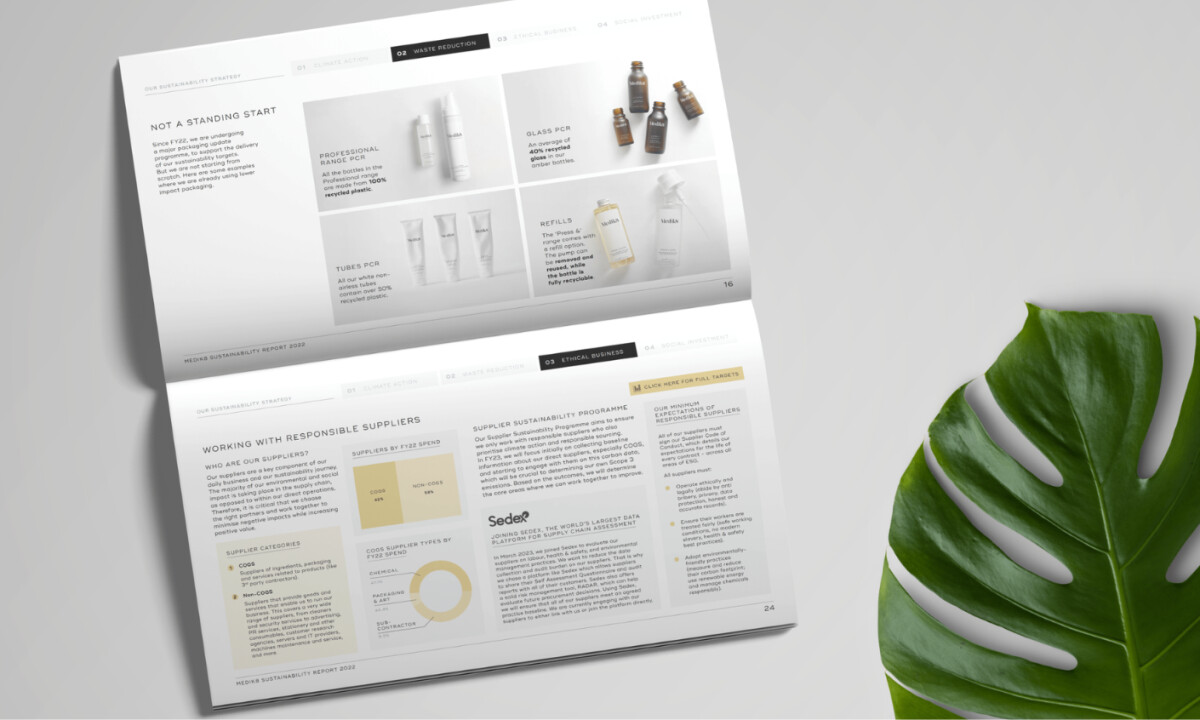
- Layout & Grid: A modular grid brings immediate order to the reports. I like how text, charts, and key metrics stay within consistent zones, which makes dense content easier to scan and compare over time without visual strain.
- Color & Wayfinding: Color is used with restraint and purpose. I appreciate how muted greens, blues, and neutrals help differentiate sustainability themes while keeping the overall tone calm and professional.
- Data Visualization: Charts stay quiet and clear through thin lines, soft fills, and generous white space. I find this effective because it keeps focus on the meaning of the data rather than the visuals themselves, which suits non-specialist readers.
- Typography: The serif and sans-serif pairing feels well judged. I like how headings carry an editorial weight, while body text and notes remain easy to read across longer sections.
- Imagery: Imagery appears sparingly and at the right moments. I appreciate how product and environmental visuals give the reader a pause between data-heavy sections without softening the report’s seriousness.
What Brands & Agencies Can Learn from Medik8
1. Let Structure Do the Heavy Lifting
A disciplined grid and consistent layout system can make complex, data-heavy content feel approachable and credible, especially in professional services reporting where clarity matters more than visual flair.
2. Use Color as a Navigation Tool, Not Decoration
Restrained, repeatable color coding helps readers move through long documents intuitively, reinforcing comprehension without distracting from the message or undermining seriousness.
3. Design Data as Editorial Content
Treating charts and graphs as part of the narrative helps translate sustainability metrics into insights that feel transparent, trustworthy, and easy to engage with.