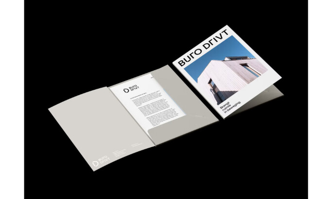
Standout Features:
- Sleek and minimalist layout
- Prominent logo and name placement
- Clean stationery design
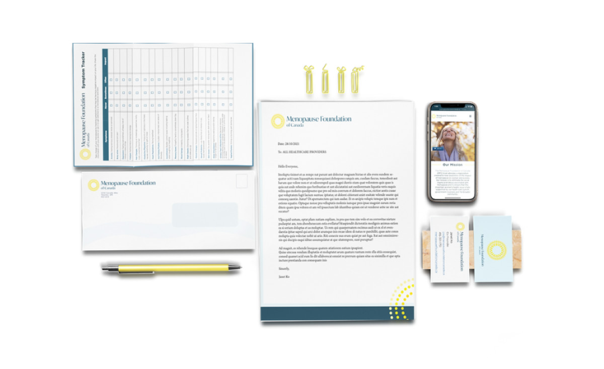
Miranda Diez's stationery design for the Menopause Foundation of Canada is a refreshing departure from the typical designs of feminine health organizations. It's bold, vibrant, and professional, celebrating this transformative stage of a woman's life with optimism and empowerment.
The sleek, stripped-back layout allows the brand's message to shine through. It avoids the clutter and predictability often associated with medical organizations. This clean aesthetic exudes sophistication and professionalism, positioning the foundation as a trusted source of information and support.
The prominent logo and name placement reinforce brand recognition and create a solid visual identity. Inspired by the sun and its radiant energy, the logo symbolizes the power and resilience of women experiencing menopause. These vibrant yellow hues and dynamic circular elements are integrated into the prints to convey a sense of movement and change.