Team Behind the Design
Print Design Analysis
I approach professional service print design by focusing on how structure, typography, and color come together to tell a clear visual story.
In reviewing Buro Drivt, I pay close attention to how these choices hold up across different physical formats since print materials often define a brand’s first impression.
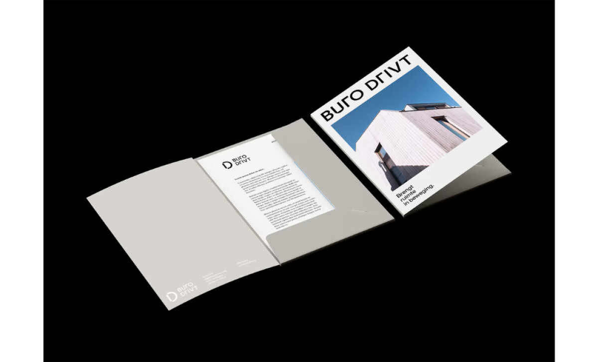
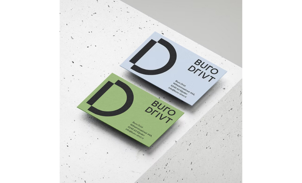
- Typography: I see clean, modern type that keeps communication sharp and accessible. The simplicity of the letterforms supports the architectural mindset the brand wants to convey.
- Layout: The folder, cards, and printed materials rely on strong spacing and a steady grid. This creates a sense of order that mirrors the agency’s focus on precision and conscious building.
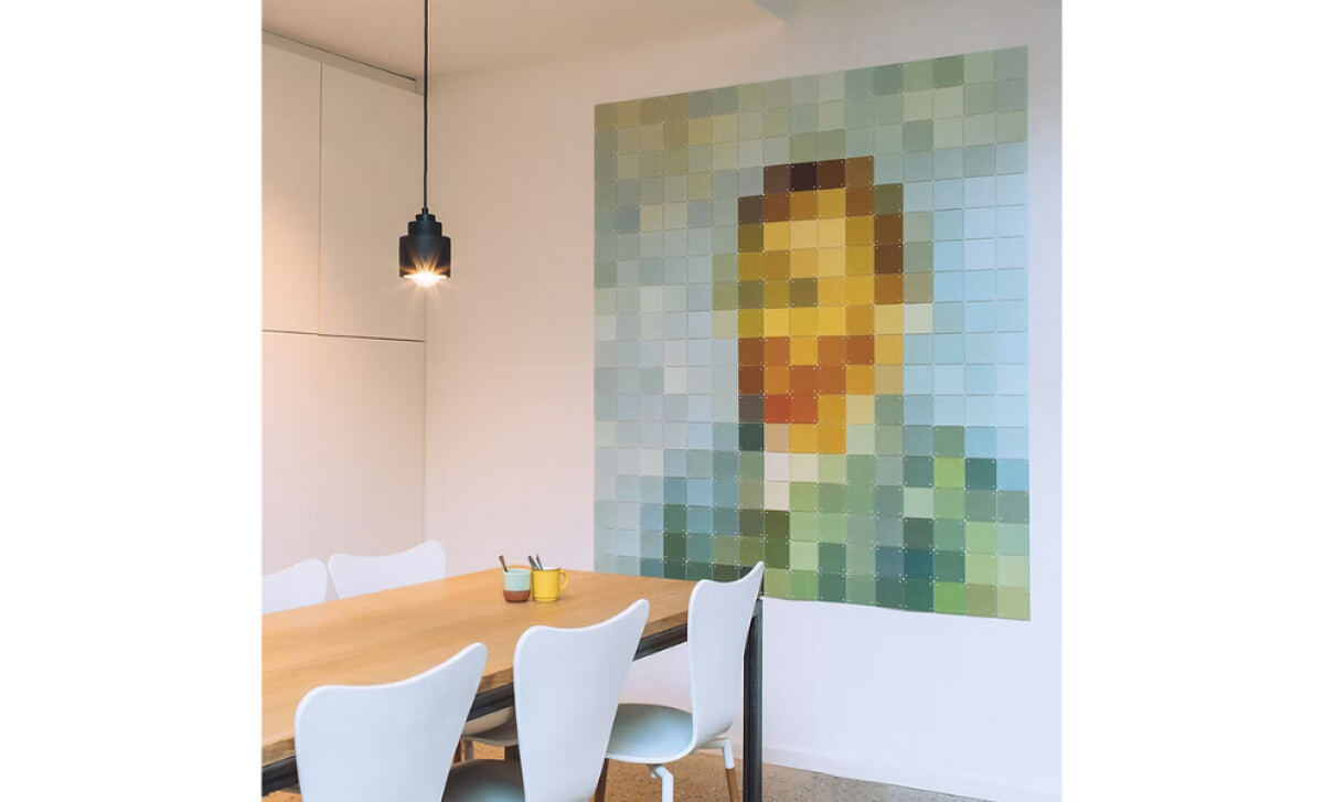
- Imagery: The pixelated Van Gogh artwork stands out immediately. Its warm and cool tones inform the palette and add personality without overpowering the identity.
- Production Quality: The muted surfaces, crisp printing, and consistent color application give the materials a refined feel. Each piece feels intentional, which reinforces the agency’s commitment to meaningful design.
What Brands & Agencies Can Learn from Buro Drivt
Studio Veer’s print system for Buro Drivt shows how structure, restraint, and a distinctive palette can express a brand’s values with quiet confidence. The work demonstrates how print can become a physical extension of an agency’s philosophy.
1. Let Grid and Spacing Communicate Professionalism
The steady rhythm of the layouts reflects the agency’s architectural mindset. Strong spacing and a disciplined grid create clarity without saying a word, proving how structure alone can communicate credibility.
2. Use Artwork-Inspired Color to Add Character with Intention
Drawing the palette from a pixelated Van Gogh piece adds warmth and personality while keeping the identity refined. It’s a reminder that color can be expressive when it has a meaningful origin, not just aesthetic appeal.
3. Elevate Print Through Material and Production Choices
The muted textures and precise printing give each piece a thoughtful, crafted feel. This shows how paper quality and finishing can turn simple collateral into a tactile expression of brand values.
About DesignRush Featured Designs
At DesignRush, we review hundreds of agency projects each month. The featured selections stand out for clarity, creativity, and execution across digital and brand experiences.
Exceptional works proceed to our Monthly Design Awards, where they’re recognized as leading examples of design craft.
Explore standout print design projects that push creativity forward:
- Best Print Designs
- Best Website Designs
- Best App Designs
- Best Logo Designs
- Best Packaging Designs
- Best Video Designs
For a full list of design agencies and related services, see our Agency Directory.