- Designer: Counterprint
- Client: Merch
- Category: Print Design — Book Covers
- Location: West Sussex, United Kingdom
- Project Brief: Create print design for the Merch book cover that presents merchandise as a strategic branding tool through a tactile and enduring visual identity.
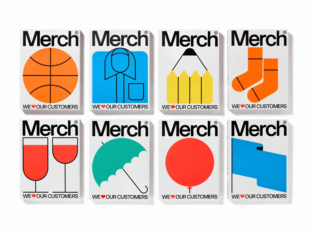
Book covers live or die on system, since the design has to carry across a whole series. Counterprint's Merch builds a modular identity where one fixed logo frame holds a rotating cast of pictogram covers.
The lockup stays constant while everything inside it swaps. "Merch" in heavy black type sits at the top, "WE ♥ OUR CUSTOMERS" anchors the foot, and the space between fills with a bold flat icon: a basketball, socks, an umbrella, two glasses of wine.
Each pictogram runs on a single saturated field. Solid orange, cyan, and green shapes with clean black keylines pull straight from mid-century trade-catalog and pictogram tradition, so the covers scan instantly at thumbnail size.
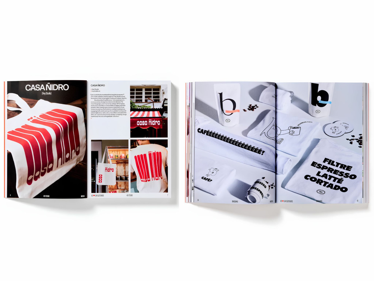
Inside, the system relaxes into editorial layouts. Case-study spreads pair full-bleed product photography with tight justified body columns, and playful lettering like the stretched "CAFÉÉÉÉÉ!" shows the same wit loosened up for long-form reading.
The promo buttons carry the identity off the page. The "I'M IN WITH CP BOOKS" pins flip the red-and-white heart between two states, proving the visual language holds up once it leaves the printed spread for a physical object.