- Agency: 86Creative
- Client: MOFIN
- Category: Print Design — Food and Beverage Print
- Location: Ho Chi Minh City, Vietnam
- Project Brief: Develop a bold print identity that reimagines traditional bakery branding through streetwear-inspired graphics, expressive typography, and cohesive brand applications.
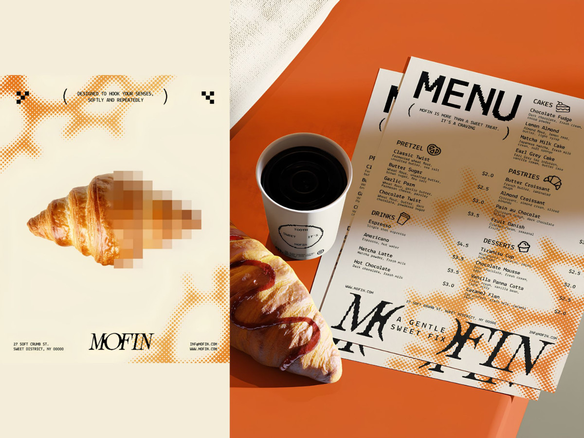
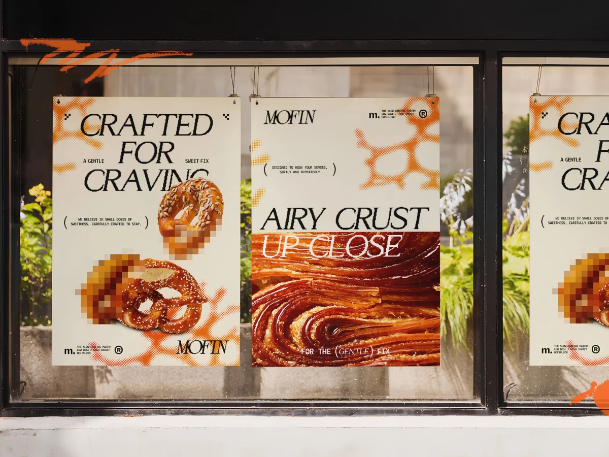
Food and beverage print design rarely borrows from streetwear. MOFIN's identity by 86Creative makes a strong case that it should. Pixelated food photography, halftone textures, and mixed-weight display type give a bakery the visual weight of a cult brand.
The pixelation does specific work. Croissants and pretzels rendered in chunky digital blur sit next to crisp macro shots, so the same product doubles as street poster and food editorial.
Typography runs the full tonal range. Chunky blackletter cuts against condensed sans-serif caps, and bracketed asides like "(designed to hook your senses, softly and repeatedly)" give the copy its edge.
The system holds across every application. Window posters, menus, and OOH billboards all carry the same cream, orange, and black palette, keeping MOFIN consistent from takeout cup to street-facing campaign.