Standout Features:
- Minimalist typography
- Luxurious material
- Black and white aesthetic
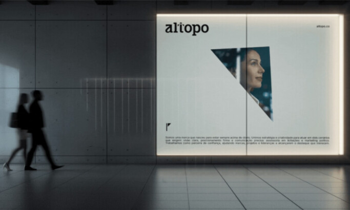
Nico van der Meulen Architects, a South African architectural firm, wanted a visual identity that showcased its modern, creative approach to architecture. Unknown Design Agency created a print piece that reflected the firm's innovative projects and is aligned with the brand's vision of transforming architectural spaces.
The print design features clean, minimalist typography that conveys sophistication and professionalism. Its understated fonts and generous spacing communicate clarity and elegance, mirroring the architectural firm's commitment to precise and contemporary designs.
This design choice allows the content to breathe, making it easy to navigate and reflecting the firm’s streamlined architectural processes.
Moreover, the print's high-quality, tactile materials reinforce the exclusivity and luxury associated with the architecture firm. The choice of materials isn't just a visual statement but also a sensory experience, giving potential clients a tangible connection to the brand. This aligns with the architects' high-end clientele, who appreciate design's aesthetic and functional aspects.
Lastly, the monochromatic palette highlights the brand's modernity and timelessness. The stark contrast between black and white creates a powerful visual impact, evoking both sophistication and simplicity. This approach particularly underscores the architectural firm's focus on sleek, geometric, and contemporary structures. It also allows the architectural imagery to stand out, maintaining a strong focus on the projects they are showcasing.
-preview.jpg)