- Article by
- Branko Dimitrijević


This website uses a colour palette of 4 colours
#F7E6DE #55B4AE #D7746F #545046
Technologies & Tools
Description
Team Behind the Design
- Agency: Peppered Pixels
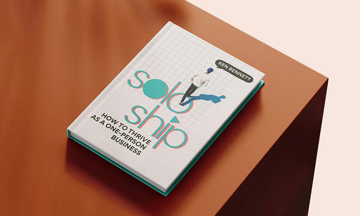
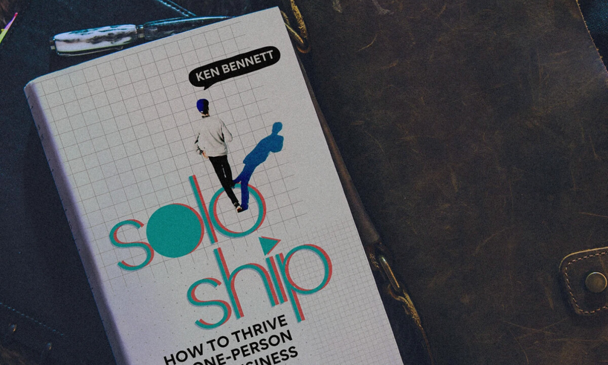
- Client: Soloship
- Category: Print — Book Cover Design
- Location: Edmonton, Canada
- Project Brief: Create a visually expressive book cover for Soloship: A Guide to Thrive that communicates empowerment, independence, and forward progression through bold typography and minimal structure.
Book cover design for personal development titles relies on clarity, confidence, and immediate conceptual storytelling. Soloship achieves this by pairing a grid-based foundation with dynamic typography that visually reinforces movement and self-direction.
Ready to elevate your designs?