Standout Features:
- Dynamic typography and visuals
- Vibrant color overlays
- Layered composition
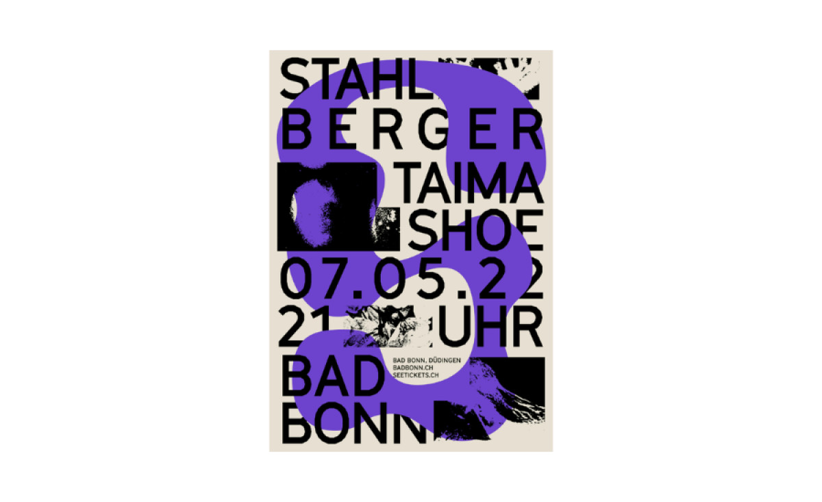
Swiss band Stahlberger is known for its eclectic music and experimental performances, and Jérôme Bizien’s poster design captures that energy through a bold and unconventional approach. The design translates the band’s creative personality into a visually arresting piece that grabs attention and draws viewers into its layered narrative.
Oversized, sans-serif type dominates the layout, with band and event details arranged in an almost chaotic yet intentional format. The typography interacts directly with the visuals, including grainy textures and distorted images, creating a raw and expressive aesthetic that complements Stahlberger’s avant-garde style.
Bizien’s use of vibrant color overlays, such as bold purples and reds, adds energy and contrast to the poster. These colors are carefully chosen to draw attention to specific elements, like the event details that serve as a visual anchor. This technique ensures clarity and creates a sense of movement and rhythm, further evoking the dynamic atmosphere of a live performance.
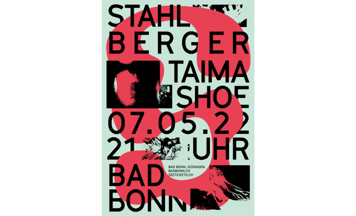
The layered composition of imagery and text introduces depth and complexity. Grainy, abstract images peek through the oversized type and color overlays, offering a visual narrative that feels both fragmented and cohesive. This layering encourages viewers to explore the poster more closely, reflecting the multifaceted nature of Stahlberger’s artistry.
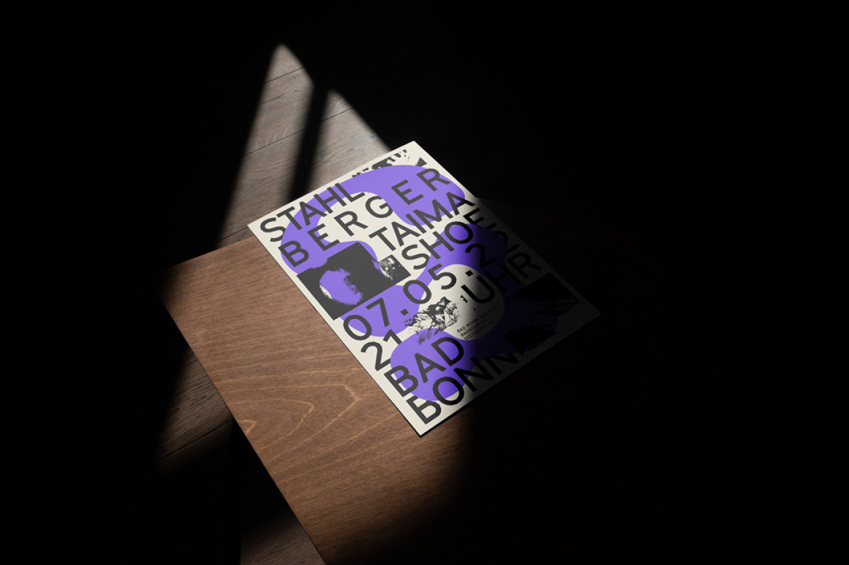
Through its bold typography, vibrant colors, and thoughtful layering, Jérôme Bizien’s poster print design becomes more than just a promotional tool — it’s an extension of the band’s identity. This visually engaging piece not only informs but also excites, capturing the essence of Stahlberger’s boundary-pushing creativity.
-preview.jpg)
