Standout Features:
- Deep navy and blush coral color pairing
- Elegant sans-serif typography with strategic weight variation
- Grid-based, editorial-inspired layouts
Ästhetik Studio developed the print identity for Status Realty, a new agency focused on luxury homes in Gold Coast, Australia. Their print materials are designed to convey the brand’s genuine service and transparency through a refined visual language that underscores craftsmanship and clear communication.
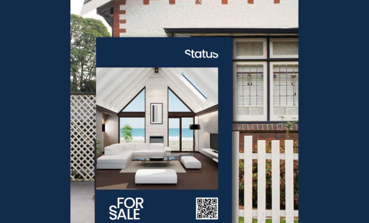
A rich navy blue serves as the dominant backdrop in the primary color scheme, complemented by warm blush coral for headings and logos.
This sophisticated pairing — navy signaling professionalism and coral adding an attention-grabbing flair — is a direct application of color psychology, which, according to research by Swarnakar (2024), helps businesses leverage colors to elicit specific emotional responses and enhance marketing strategies.
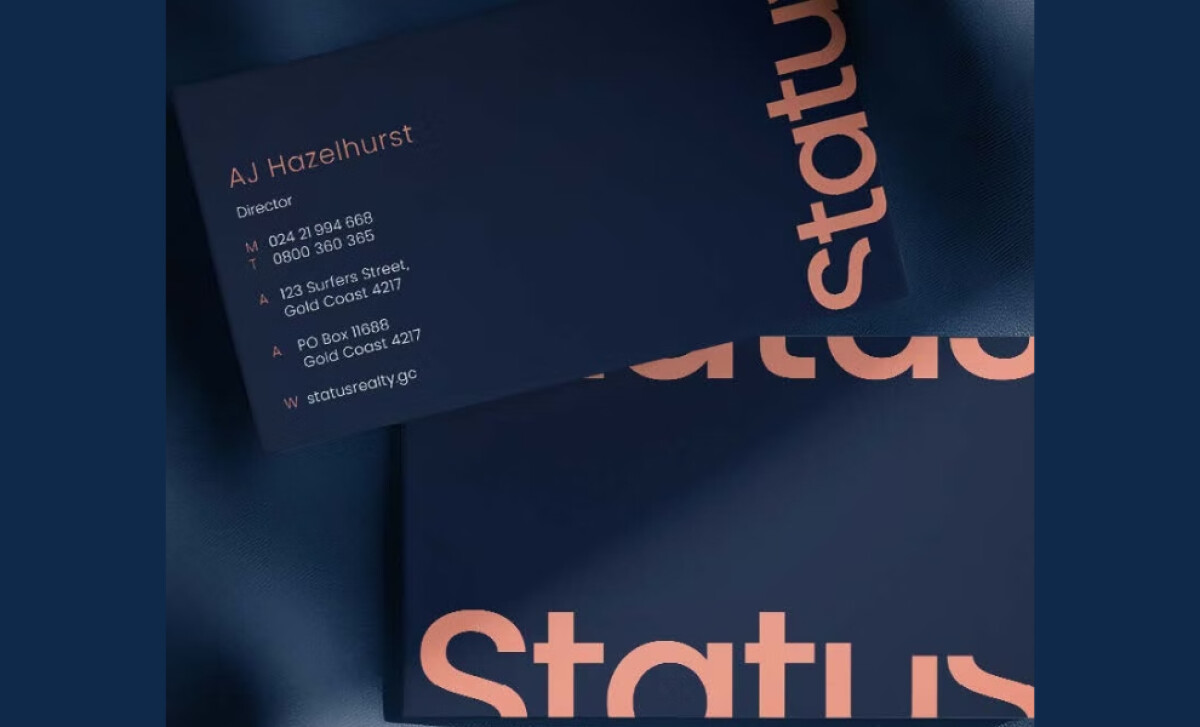
The brand uses an elegant geometric sans-serif font. Its thin, evenly spaced characters and varied weights — light for headings, regular for text — lend a polished, high-end feel. This supports readability and reinforces Status Realty’s positioning as premium and relevant in today’s real estate market.
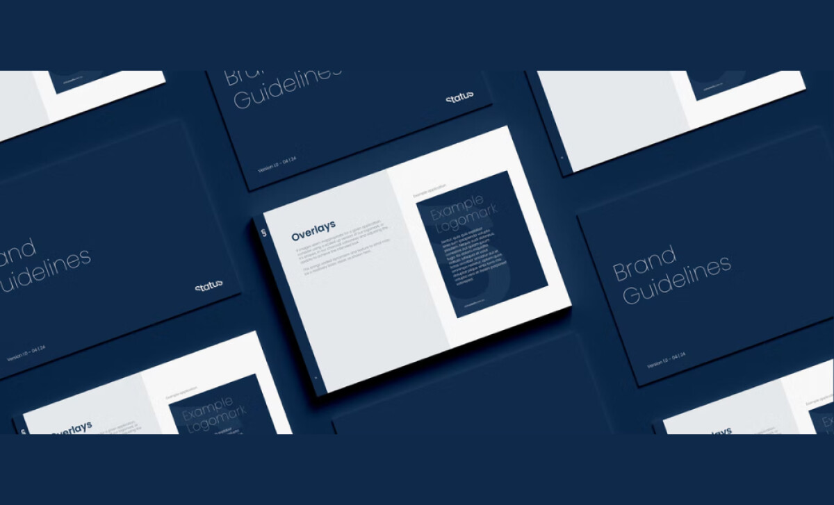
An editorial-inspired, grid-based composition is used for the printed materials. This features precise alignment, generous margins, and abundant white space that frames headlines, logos, and images. Such a structured layout enhances readability and lends a sophisticated, uncluttered feel to all brand touchpoints, from cards to signage.
Ästhetik Studio's print identity for Status Realty masterfully uses restraint and refinement to build a modern brand. This project demonstrates how to position a real estate agency as modern, trustworthy, and aligned with the expectations of a high-end clientele seeking exceptional service.