- Agency: Ordinary People
- Client: Stray Kids
- Category: Print Design — Album Cover
- Location: Seoul, South Korea
- Project Brief: Create print design for Stray Kids’ DO IT album that unifies thorn and flame motifs into a distinctive visual identity, extending its custom typography and symbolic artwork across the album packaging.
An album cover sets the mood before you hear a single note. Ordinary People built Stray Kids’ SKZ IT TAPE “DO IT” around two symbols: a thorn for taboos and a flame for the energy that breaks past them.
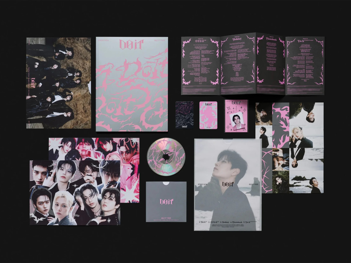
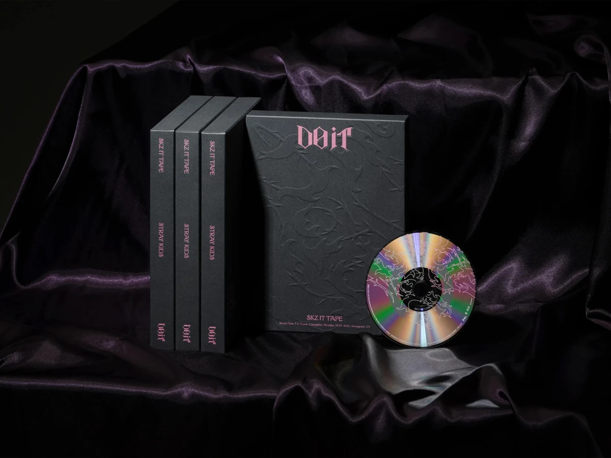
The two shapes twist together into the pink, gothic-style letters of the title. That wordmark sits on black linen boxes, where the same thorns are pressed into the surface as a raised pattern.
Inside, a silver photobook cover carries a bold pink tangle of thorns and flames. Lyric pages flip the palette, with white vines and starbursts curling across dark gray spreads and around elegant serif track titles.
Even the small pieces follow the system, from photocards to an iridescent CD etched with thorn line art. Every item feels like part of the same world, so opening the box becomes part of the album experience.