- Agency: Studio Vandal Co.
- Category: Print Design — Professional Services
- Location: Armenia, Colombia
- Project Brief: Produce print materials that communicate a bold studio identity through expressive typography and visual statements.
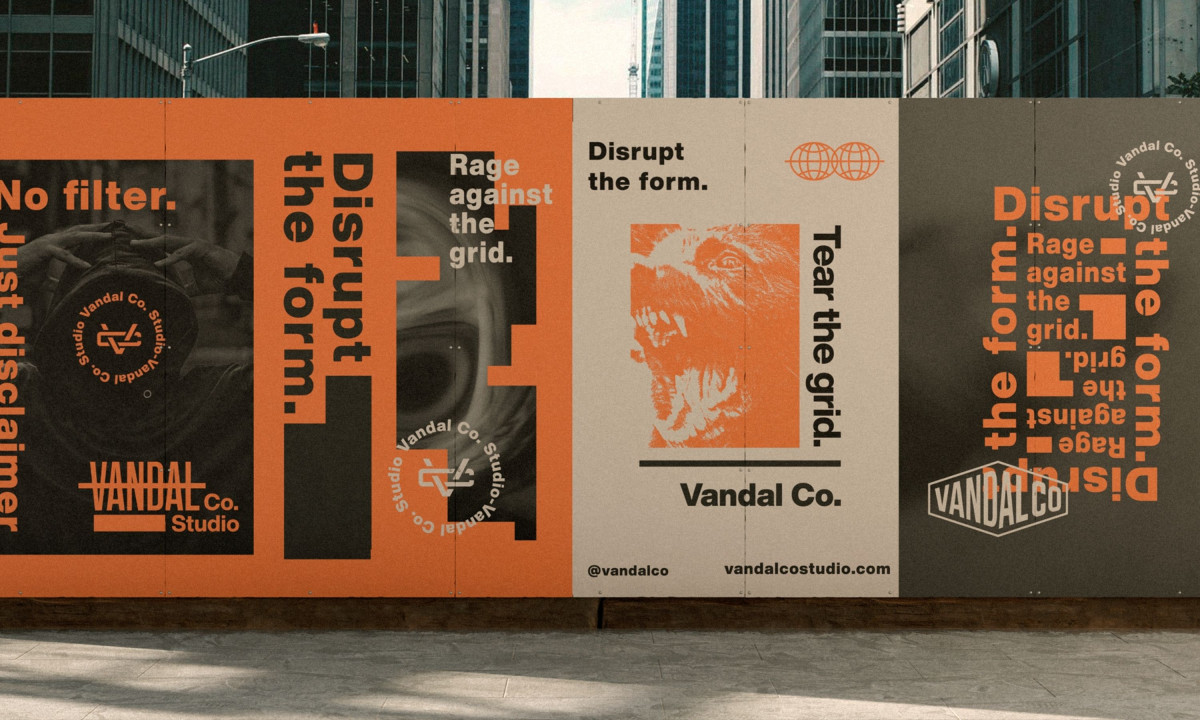
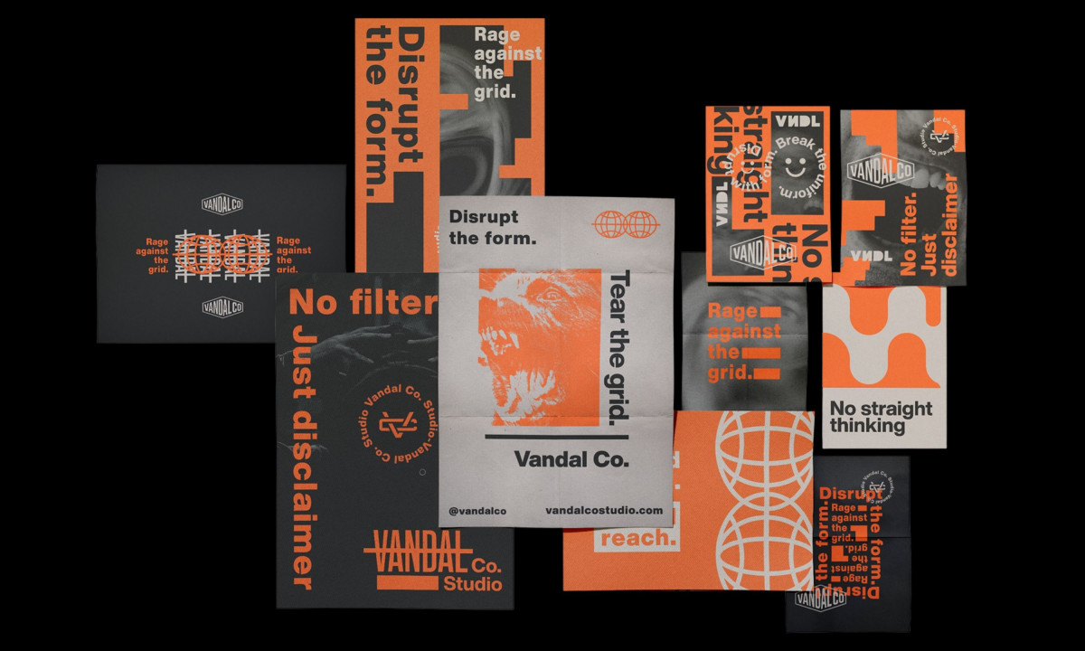
Studio Vandal Co. designed its own identity, which means nobody told them to calm it down. The result is a professional services print system that runs on safety orange, charcoal, and cream with the subtlety of a construction site and the confidence of a studio that named itself Vandal.
Self-branding is a different design problem. There's no client brief, no brand guidelines, no approval chain. The risk is self-indulgence. Studio Vandal avoids it by keeping the system functional across formats.
Street posters, branded apparel, and collateral all follow the same visual rules: oversized type, high contrast, and distressed textures that look like they were run through a photocopier one too many times.
The typography carries the identity. Slogans like "Tear the Grid" sit in oversized, grid-breaking layouts that treat white space as something to fill rather than protect. The type is loud on purpose. For a studio selling creative aggression to clients, the print system is the portfolio and the pitch deck rolled into one.
The palette is the simplest decision and the most effective one. Safety orange dominates every surface. Against charcoal, it reads urgent. Against cream, it reads confrontational. The studio picked one color and committed to it across every touchpoint, which is braver than most agencies manage with their own branding.