Standout Features:
- Sophisticated color palette inspired by nature
- Minimalist layouts with modern typography
- Elegant branding consistency across materials
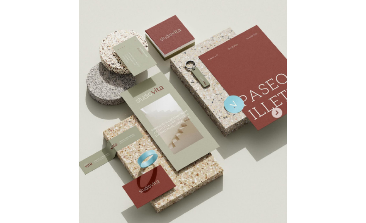
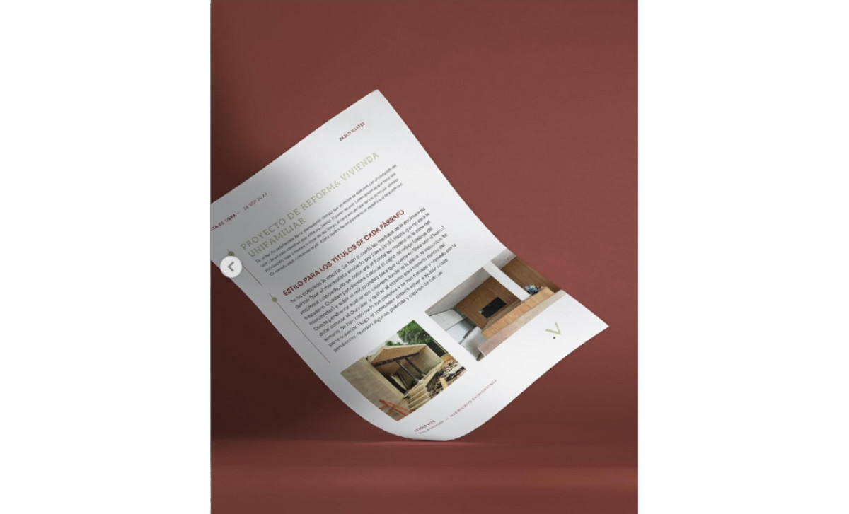
Studio VITA is an architecture and interior design firm that emphasizes precision, artistry, and harmony with its environment. Rojo Estudio’s print design embodies these values through a minimalist yet sophisticated approach, aligning the firm’s visual identity with its architectural expertise.
Its muted terracotta, sage green, and beige color palette reflects the brand’s connection to natural elements and creates an understated elegance that conveys professionalism. The consistent use of these colors across various printed materials ensures a cohesive identity while evoking calmness and balance — key qualities in architecture.
Clean, sans-serif fonts dominate the visual language, emphasizing clarity and simplicity. The use of negative space is particularly effective, allowing the content — whether it’s contact information or project highlights — to stand out. This minimalism mirrors the brand’s architectural philosophy, delivering a visual representation of its interior design approach.
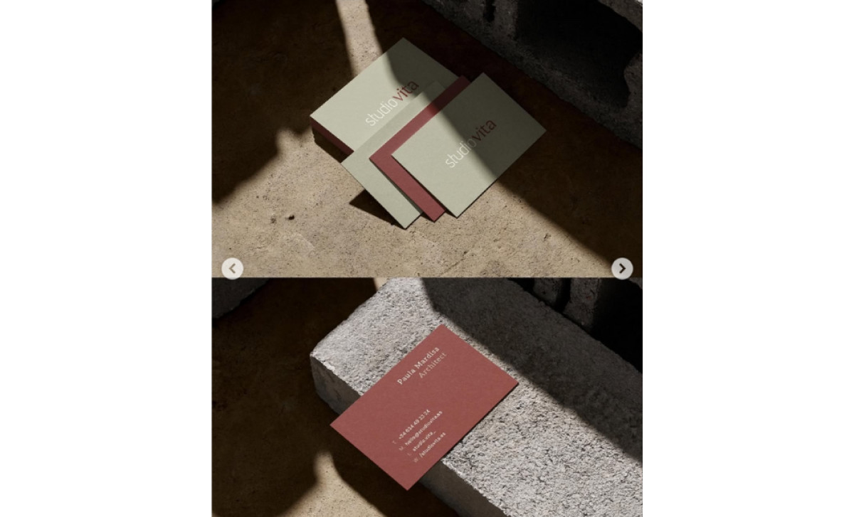
The branding consistency across materials ties the design together, creating a unified experience. Whether it’s business cards or documents, the design elements are consistent, strengthening brand recognition and leaving a lasting impression. This cohesion reflects Studio VITA’s ability to deliver thoughtfully integrated and harmonious architectural solutions.
Rojo Estudio’s professional services print design encapsulates Studio VITA’s ethos, creating a visual narrative that is both beautiful and functional. By combining a refined aesthetic with high-quality execution, the design positions the brand as a leader in architectural and interior design services.
-preview.jpg)