Standout Features:
- Elegant color story
- Combination of font styles
- Prestigious look
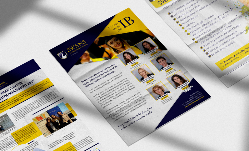
Redline Solutions’ print design for Swans International School combines various visual elements that convey sophistication, clarity, and a sense of prestige. At the core of this design is the elegant color palette of gold, white, and black, evoking a luxurious and positive impression.
Golden yellow, often associated with high standards and excellence, sets a tone that aligns perfectly with the school’s reputation. The design incorporates multiple typefaces strategically placed to enhance the visual dynamic and readability of the content. Serif typography in the headers provides a sophisticated look, while the sans-serif body text ensures clarity and readability.
Additionally, handwritten lettering in the quotes adds a personal and intimate touch to the overall design. This combination of typefaces creates a dynamic and visually stimulating environment, guiding the reader’s eye smoothly through the content.
Complemented by stunning images, the print design showcases the school’s vibrant community and commitment to holistic education. It paints a vivid picture of life at Swans International School, appealing to prospective students and parents.