The Print Design's Clever Icons Convey A Powerful Message
FNE is a powerful and influential labor union in Portugal. It’s a labor union with a long history of enacting and calling for change. And to commemorate 30 years of service to the community and to the workforce, the team at FNE decided to go with a comprehensive booklet to celebrate the long and rich history.
This book highlights the triumphs the FNE has made over the years, as well as touches upon impactful moments in Portuguese history.
Embedded in these print designs — from the booklet to posters and beyond — are creative and illustrative icons that all come with their own hidden, deeper and more powerful meanings. These icons take on the forms of keys, stars, waves and more.
And while they hold a deeper meaning, they also add a creativity and an integrity to the overall design that makes it immediately compelling even if you know nothing about the union and everything it's done for Portuguese society.
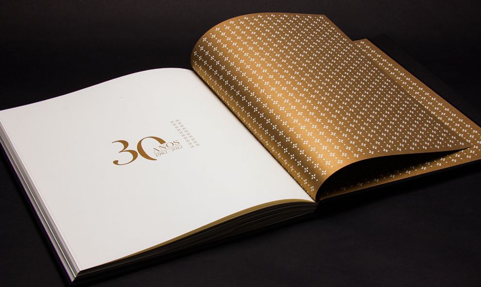
These images are embossed in a shiny, gold foil. And they sit as a top layer on these designs — like stamps that add an authority and a prestige. They are a powerful marker that shows the success of this union.
Print designers understand the power of symbolism to create a visual representation that resonates with the brand's values and reinforces its identity.
The stars, according to the brand, represent the stars of the union. They show power and strength. They show a legacy and a sophistication. They make an impact.
The keys that sit subtly and proudly embody the knowledge of this union and all of those that have participated.
The waves call to the wide open seas. They’re mysterious and full of adventure and discovery. It shows the path this union has taken to reach the levels it has.
But outside of the powerful meaning behind these symbols, these add to the design on a style note. They bring a playfulness and a personality that align this union not just as a leader in the professional, governmental world, but one that cares about its members.
A Monochromatic Color Scheme Adds Drama And A Sense Of History
Playme Studio created a book for the country’s oldest union, FNE, for their 30-year anniversary. This booklet is regal and authoritative. And it’s a powerful testament to the history and legacy that have shaped not just this union, but all labor unions in the country.
And to embody such a majestic history, the design team went with a moody and minimal aesthetic to give the designs a modern and luxurious edge highlighting its long legacy of importance to the country.
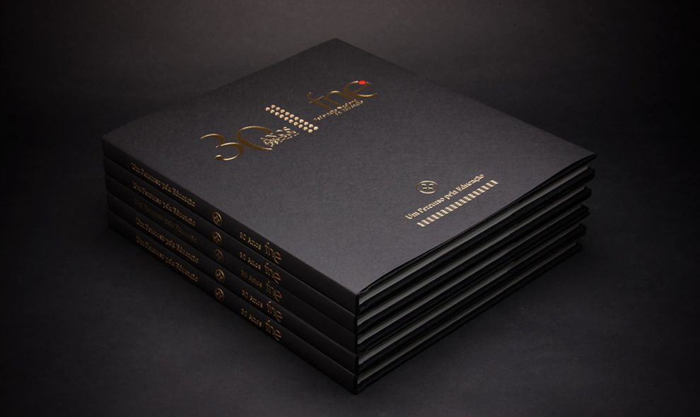
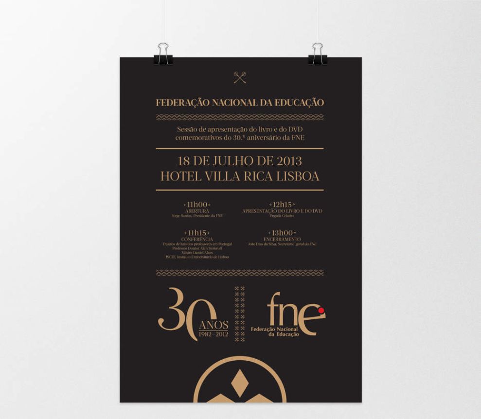
The book covers are minimalistic yet powerful and use black rough paper and gold foil stamp for a slightly embossed title.
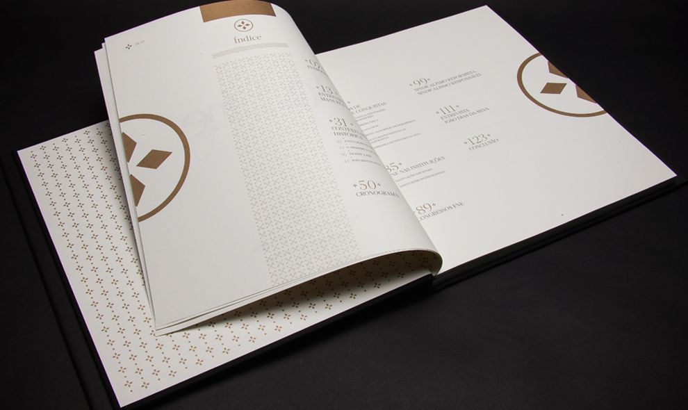
The inside paper has a very light hint of ochre, which ties all of the book's details together.
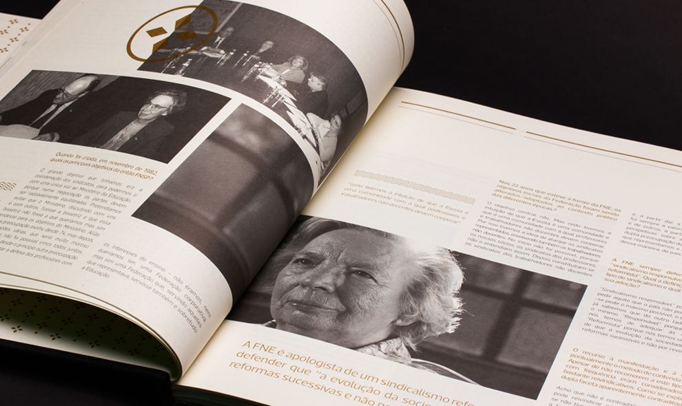
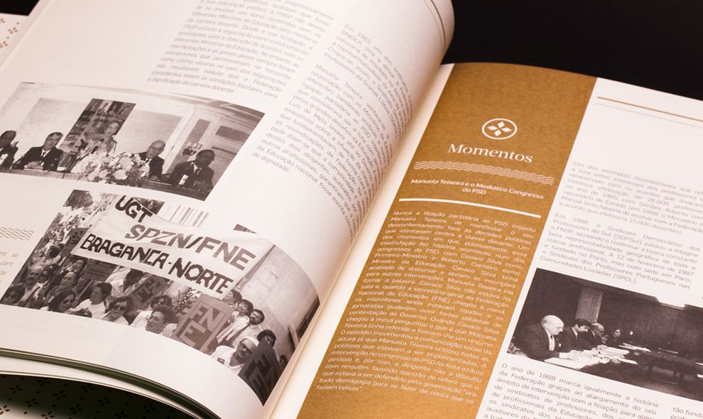
The images are faded in a black and white filter to give them an aged, rustic look that calls to the history. And the overlaid elements in slightly colored hues add a touch of excitement that jumps out at you slightly.
The layout of this book focuses on the darks and lights to emphasize the good and bad times the country and the labor force has had. And the ways these colors and overall aesthetic combine really does stand as a testament to the 30 years this union has lived through.
Booklets like this aren’t always interesting to look at or read through. But the designers here made it a point to infuse an effervescence and a message into this booklet to ensure that anyone who looked at it would be compelled to pick it up and learn more.
Gold Accents Gives These Prints A Luxurious Aesthetic That Can’t Be Ignored
As we’ve said, the colors here really do jump out at you. The blacks and whites set a somber and impactful tone. But the gold foiling and accents also exude a luxury that aligns these materials as important and worth your while.
Branding experts have always recognized the power of visually striking colors to elevate the perception of value, so the gold accent successfully creates a sense of exclusivity!
The colors exude power and luxury. However, the use of black also reflects struggle, while gold portrays commitment and achievement. There’s an importance to the colors here as you can see.
They are much like the icons — they hold a deeper meaning and call to the struggles, triumphs and experiences of the people living and working in this country.
Gold endpapers use a star pattern that represents the union. The inner spreads are monochromatic and minimalist. They use black and white photography to symbolize time and history, but create a more contemporary layout by placing these images in different columns.
And this history is brought to life thanks to the clever color pairings and embellishments infused into this design. The designers pulled out all the stops for this 30-year anniversary.
After all of this time, FNE — which is the oldest union in Portugal — can also show off a little. It can show the people around them that they mean business and that they’re good at what they do. It’s not that their prestigious with who they work with, but more about the work that they do. They will fight for their union members and do everything they can to ensure working conditions in their country are reasonable and fair.
They’ve been doing it for 30 years and these prints prove that they will be doing it for years to come.
The FNE Print Design's Contemporary Layout Shows The Union And Its Years Of Progress
As we’ve discussed, there are a lot of crucial elements to this design that really elevate it — it’s more than just a cheesy anniversary booklet. It’s a work of art and a piece of history that holds 30 years of struggle, freedom and accomplishments.
The book does this with a creative color scheme of black, white and gold. Similarly, a minimal aesthetic sets the mood and powerful icons hold a deeper meaning that talk about the union and its robust history.
But the booklet itself, while it is a story, is not organized like you’d think. It’s more creative, modern and contemporary making it the perfect design for the 21st century, embodying a union that has grown with society itself.
Images get creative and cool layers and overlays. The text is featured in interesting displays and formats. The book plays with shape and layout in a phenomenal way as to highlight everything the union has been through and where it is today.
The title is placed in the upper middle part of the cover and uses a sans serif font for the date. This is tied together with a pattern, that creates a formal yet modern approach to the layout, and increases the importance of the date "30 years."
There’s a playful creativity infused everywhere you look that complements the regal nature. And it grabs your attention immediately.
What Is The FNE?
The FNE is a labor union in Portugal. It’s a powerful institution for the working class, and to celebrate 30 years of success and advancement, the union sought the help of design studio Playme to create a booklet and supplementary print materials to honor the powerful history.
According to the agency:
In 2013, the country's oldest union linked to education celebrated 30 years of existence. To mark the date, the FNE decided to compile the last 30 years of struggles and achievements in the book. The Creative Footprint was responsible for research, content development, project management and coordination, Playme took charge of art direction, paging and graphic design. Iconography has a preponderant role in the book, the keys symbolize knowledge, the stars that together make the patterns symbolize the union, the waves refer to the sea and the discoveries. The use of black reflects the struggle and the gold, achievement and commitment.And the resulting materials really do capture an energy and an essence that this labor union has carried with it in its 30 years of activity. These prints are robust, clever and informative. And they set the mood, letting viewers know that this is a union with an authority that will continue making changes for years to come.
Print designs are powerful tools for all brands of all types — you can see that example as clear as day here. And these designs only add to the credibility of the integrity of this union, taking nothing away from its prestige.
How FNE Uses Print Design To Capture A Robust History
The FNE labor union decided to have some fun on their 30 year anniversary and created a booklet that captured this history in a few stunning pages.
From a dramatic color scheme and specific aesthetic to powerful imagery and a contemporary layout, these books dare to be read. And readers can learn a thing or two from the pages within.
Print designs make an impact, and here they show how the course of history was drastically changed for the better.
Build a robust brand with the help of these logo design and branding studios!


