Standout Features:
- Pop art-inspired illustration
- Vibrant contrasting colors
- Ample negative space
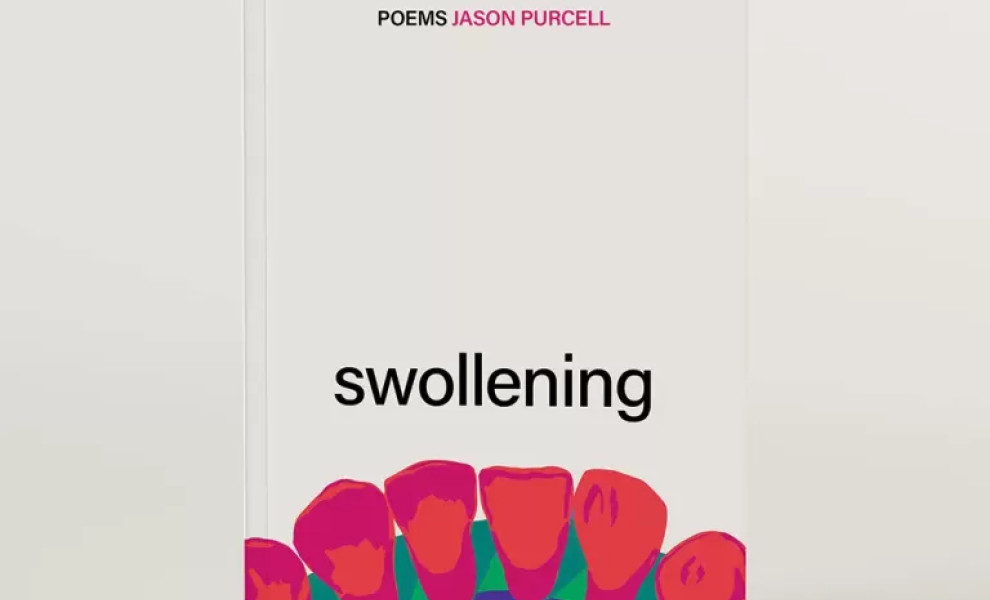
Fleck creative studio's cover design for the poetry book "Swollening" employs a simple yet impactful design that intrigues the reader.
A pop art teeth illustration directly references a line in one of the poems, "seeing your teeth from the wrong side." The illustration evokes a strong feeling by depicting teeth in a macro perspective.
Furthermore, bright, clashing colors add an artistic flair to this key image. They heighten the tension and visual interest, reflecting the raw and vivid emotions expressed in the poetry.
The vast negative space shifts the focus to the image, making the cover even more attention-grabbing. It creates a stark, minimalist backdrop that exemplifies the "less is more" design principle.
Get a chance to become the next Design Award winner.
SUBMIT YOUR DESIGN