Standout Features:
- Artistic nude photography
- Compelling image layout
- Classic, understated color palette
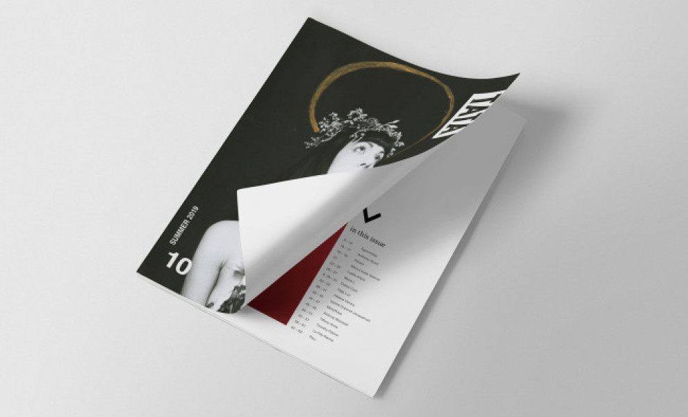
Hoerl Design's rebranding of TATA (Things As They Aren't) Magazine is a masterclass in tasteful presentation. The magazine delves into the human body's exploration through artful nude photography, thoughtful essays, and visual art. Its pages are adorned with these photographs, arranged in layouts that balance boldness and subtlety.
The color scheme is intentionally restrained, mainly employing whites, blacks, and muted tones. It lends a timeless quality that complements the artistry of the content. The rebranding elevates the magazine's content without overpowering it. The visuals encapsulate the magazine's DIY value and collaborative essence with its rough, minimalist aesthetic.
Get a chance to become the next Design Award winner.
SUBMIT YOUR DESIGN
-preview.jpg)