Standout Features:
- Brunei yellow
- Big, bold serif typography
- Minimalistic layout for inner pages
The Scoop Magazine’s print design, crafted by Liyana Hanif Design, blends national symbolism, professional typography, and a minimalist layout, creating a compelling visual identity for the publication.
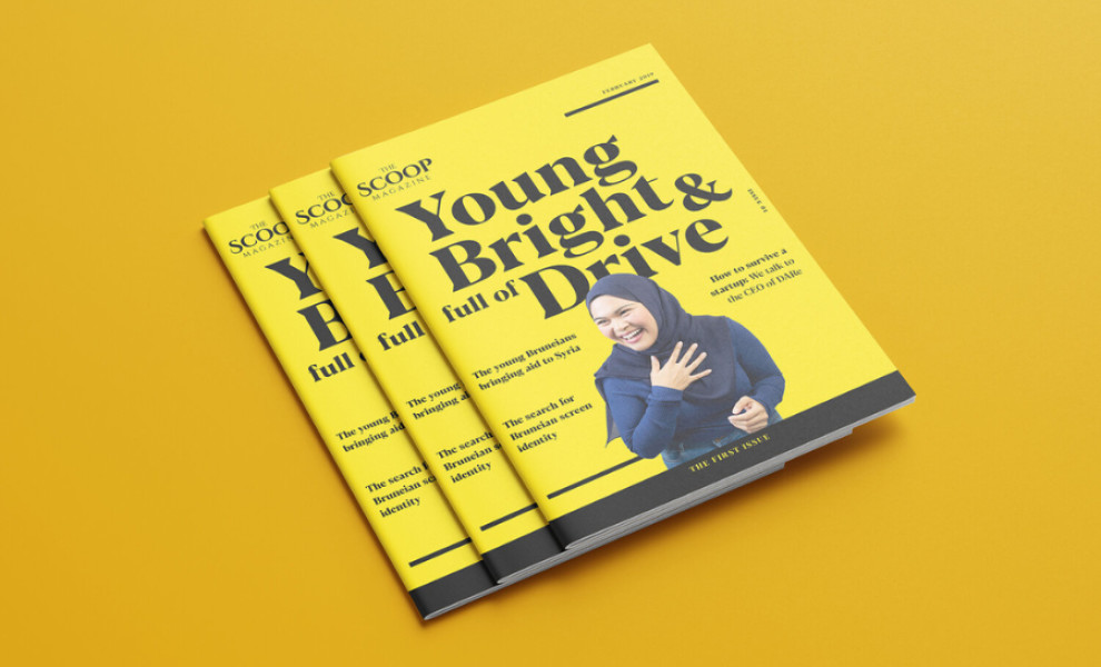
The front cover of The Scoop Magazine is dominated by Brunei yellow, the same shade found on the country's flag. This choice immediately signals the magazine's cultural roots and sets a lively and dynamic tone.
The cover features big, bold serif typography reminiscent of the New York Times font. This choice of typeface exudes professionalism, lending the magazine an air of reliability.
Inside the magazine, a minimalistic layout ensures that neither element of the design goes unnoticed. Thanks to the ample spaces, all articles and high-quality images captured by local photographers get their time to shine. The minimalistic approach also enhances readability, making the articles more engaging for readers.


