- Agency: ContentFormContext
- Client: TIME FLAGSHIP
- Category: Print Design — Retail
- Location: Not specified
- Project Brief: Create print design for TIME FLAGSHIP that extends its “Timeless Nature” concept through refined typography, frame-inspired graphics, and distinct yet connected visual identities.
Print that spans a entire retail space carries one identity across many rooms. ContentFormContext builds the TIME FLAGSHIP system on a language of light and frames, then splits it so the store and its Cafe TIME each hold a distinct mood.
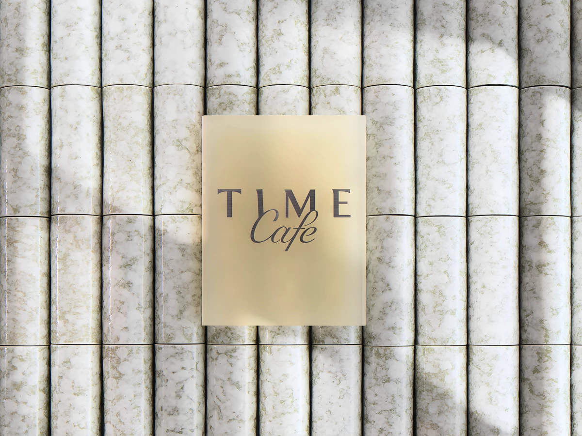
The café logotype sets the softer half of that split. A handwritten "Cafe" layers over the serif TIME mark against a pastel gradient, so the frosted window sign reads as the poetic, romantic side of the brand.
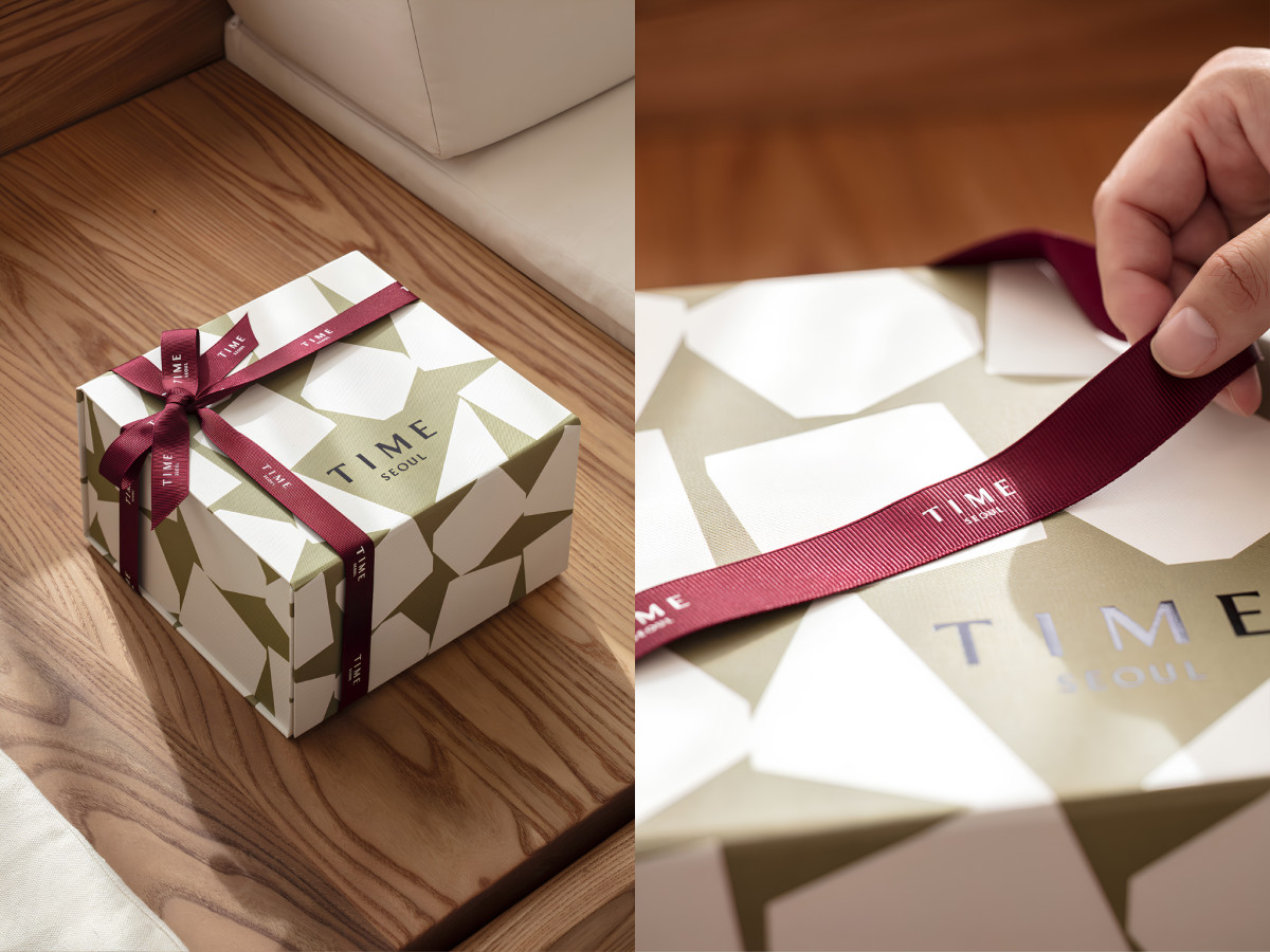
The retail packaging pulls the system in the opposite direction. TIME Seoul's deep burgundy ribbon and sculptural green-and-white facet pattern wrap the gift box in a crisp, refined look that stands apart from the café's wash of pastel.
The smaller touchpoints thread the two identities through every detail. Lilac menu folders, tiled bags, and shelf collateral spread the TC frame mark and T-letter pattern across the flagship, so each piece belongs to one family while keeping its own voice.