Transport For London’s Safety Posters Drive Home Main Marketing Messages
Transport For London is a governmental body that’s in charge of transportation in London. They take care of the Underground, commuter trains, cycles, buses and more. It’s the job of this service to ensure that everything is running smoothly, safely and effectively.
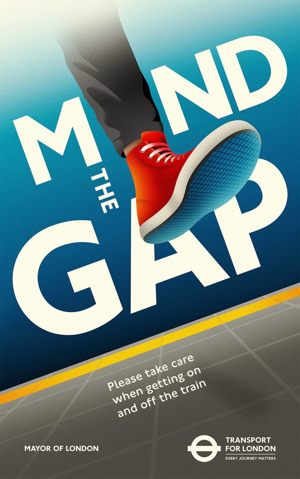
Anyone who has ridden the subway in London is familiar with the phrase “Mind The Gap,” but the service decided that they needed to be more proactive about safety while riding. Accidents happen, and it’s the job of Transport For London to do everything in their power to prevent them.
The service does their best to prepare people, but there are a lot of factors to consider. And the service knew that the only way to drive their point home was to bombard riders with constant reminders.
As a result, Transport For London commissioned creative agency La Boca to create safety posters that would stick with commuters and hopefully decrease the number of accidents that happen on the Underground each year.
These posters hang inside subway stations and inside subway cars. And the designs demand your attention.

The Transport For London Print Designs Utilize Bold Typography & Moody Color Gradients
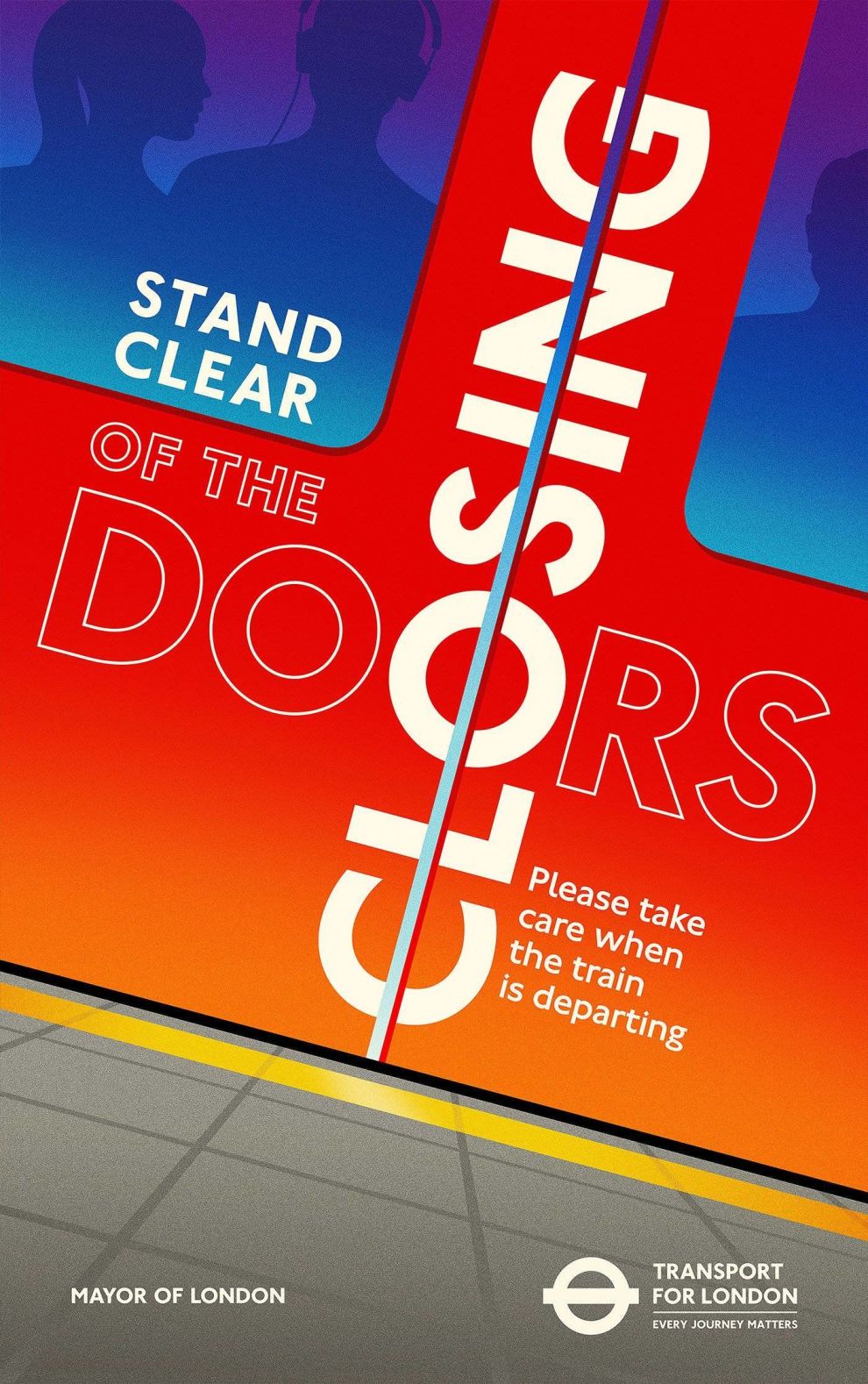
The first thing to stand out to you in this design is the use of color. It’s bright and bold and colorful. And the way the gradients glide across the posters is simply mesmerizing.
Whether going left to right or up and down, the movement invoked by these colors entices you to get a closer look and really pay attention.
These colors catch your eye immediately. They are in your face in their brightness and potency. And the movement evoked by the gradients makes you step closer.
And once you do, you really get a good look at the design and its purpose.
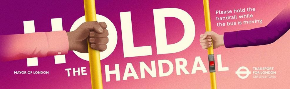
These posters were created to warn passengers and commuters about the dangers of improper riding. They urge people to mind the gap, beware of the closing door and be aware of your surroundings.
And it’s the big, bold and brash white typography that gets these messages across.
Whether completely colored in, in a bright white coloring, or simply outlined, this typography makes a statement. And its orientation is fun and flirty too — sometimes big, sometimes small and sometimes even sideways.
This typography elevates these designs and adds an even more friendly and approachable edge to them. Of course, these prints should be taken seriously, but that doesn’t mean they can’t connect with commuters on a personal level.
And by combining color and typography, these print designs do just that.
Transport For London’s Safety Posters Incorporate Clever Illustrations
Another exciting element of these print designs are the quirky and fun illustrations. They are created in big and bold ways, almost leaping out of the posters themselves.
From feet walking across platforms to giant pints of beer, this design dares you to look away — because you simply won’t want to, they’re too much fun!
This playfulness is infectious. It makes you smile. But most importantly, it makes you pay attention. It pulls you in and keeps you engaged with the content that the poster is trying to promote. And these images are images that people can connect with.
People ride the Tube after a few pints all the time, so they can see this resonating with them. These cartoonish illustrations lighten the mood while simultaneously giving commuters something they can connect within their own lives and in past experiences.
These cheeky cartoons add just the right amount of personality and flare to give Transport For London a more approachable persona.
The Transport For London Poster Designs Capture Consumers With Bright Creativity
These safety posters are bright, bold and in your face. They instill a sense of urgency, though their playful nature makes you smile more than it makes you fearful. They promote precaution and proactivity in a fun and exciting way.
There’s is an old-school, laid-back vibe to these designs. From the typography to the illustrations and the color — it feels like these posters belong in the 90s. There’s a nostalgic quality to them that hits people on a personal level.
Color gradients make up the background of these posters and often fill in the illustrations in a bright and bombastic way.
The typography is big and bold — taking up the majority of the design and urging people to not only read the words but heed the warnings.
Clever and cute illustrations play on the words used and the modes of transportation themselves La Bocca hit the nail on the head with these prints, and people will be happy to see them splashed across subway walls and Tube doors.
There are a lot of design elements in these prints. And they all demand to be seen.