Standout Features:
- Distinctive color scheme
- Typography resembling a typewriter font style
- Eccentric and laid-back
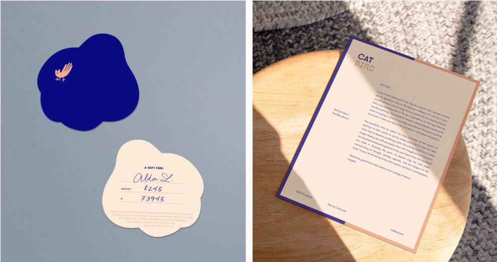
Catbird Hotel was looking for a perfect way to distinguish itself from its competitors with eccentric print material. Then, Public Fantasy® came to help and created a unique print design that goes well with the brand's distinctive color scheme.
The vivid blue hue sets up an energy-laden base. It is contrasted by a pastel peach shade that instills a sense of kindness and gentleness into the mix. Whether in typography, entire backgrounds, or outlines and visuals, the two primary colors are perfectly balanced.
This design also features typography resembling a typewriter font style, which with its vintage appearance, provides a sense of intimacy, dedication, and warmth every hotel guest needs.
Get a chance to become the next Design Award winner.
SUBMIT YOUR DESIGN