- Agency: Thinking*Room Inc.
- Client: Two Blocks
- Category: Print Design — Hospitality
- Location: Jakarta, Indonesia
- Project Brief: Create a dynamic print identity for Two Blocks that expresses neighborhood connection through modular forms inspired by shifting cityscapes and shared interactions.
A hospitality print identity built on two plain rectangles could read as cold and corporate. Thinking*Room Inc. flipped that for Two Blocks, letting the two forms lock, slide, and stack across the layouts like a little cityscape that keeps rearranging itself without ever losing its shape.
Those two blocks carry the whole story. Each one stands for a neighborhood with its own personality, and the way they meet and shift around each other on the page mirrors the closeness the restaurant is named for.
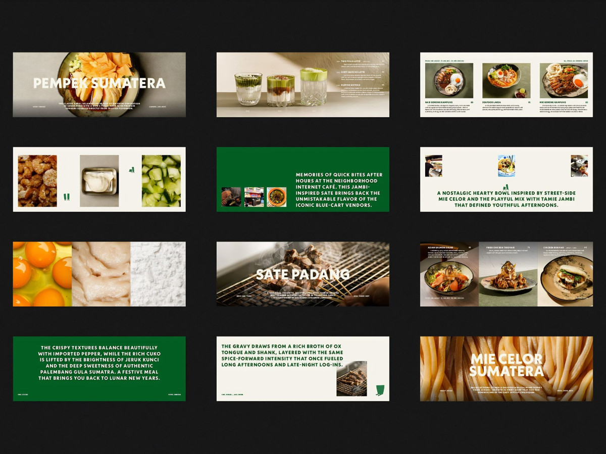
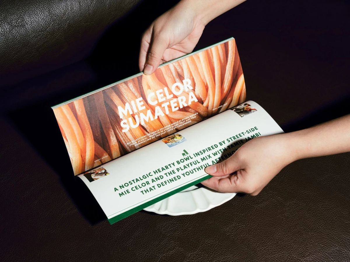
Nowhere does the print work harder than the menu book. Full-bleed noodle and pempek photography, deep green text spreads, and dish titles like "Mie Celor Sumatera" trade off page to page, so a long Sumatran-Asian lineup reads like a magazine instead of a checklist.
Best of all, the blocks jump off the page as real objects, painted onto green wooden bricks that prop up the branded cups. That bit of physical play proves the printed mark carries into three dimensions, which is exactly right for a place selling neighborhood warmth over polish.